Summary Statistics
While the mean and median are the most common measures of central tendency, several other metrics can provide a more complete picture of a dataset. Collectively, these are known as summary statistics.
As the name implies, summary statistics summarize the data in various ways to provide a better understanding of its distribution. Typical summaries include the total count, the lowest and highest values, the mean, median, mode, and standard deviation.
From the sorted list of ages in the previous chapter, we can add the following summaries:
- Total count: The number of records in the dataset.
- Maximum value: The highest value. In Python, you can use
max(ages)to get 58, the age of the oldest person in our sample. - Minimum value: The lowest value. In Python, you can use
min(ages)to get 2, the age of the youngest person in our sample.
Note: For this exercise, we used a small sample to keep the explanation simple. In a real-world scenario, you would run your analysis on the entire dataset.
Mode
The mode is the value that appears most frequently in a dataset. In our sample of ages, the modes are 2, 14, and 35, as each appears twice. If no number is repeated, there is no mode.
Range
The range is the difference between the maximum and minimum values. In our age sample, the range is 58 - 2 = 56.
Percentile
A percentile is a measure that indicates the value below which a given percentage of observations fall. For example, if your ACT score is in the 90th percentile, it means 90% of students who took the test scored the same as or lower than you.
Quartiles
Quartiles are an extension of the median concept. They divide the data into four equal parts:
- The first quartile (Q1) is the 25th percentile.
- The second quartile (Q2) is the 50th percentile (the median).
- The third quartile (Q3) is the 75th percentile.
The interquartile range (IQR) is the difference between the third and first quartiles (Q3 - Q1) and represents the middle 50% of the data.
Standard Deviation (SD)
While the range provides the spread between the minimum and maximum values, the standard deviation is a measure that summarizes the amount by which every value in a dataset varies from the mean. In essence, it measures the spread or variability of the data.
- A low SD indicates that the data points are clustered close to the mean.
- A high SD indicates that the data points are spread out over a wider range of values.
The standard deviation is the most widely used measure of dispersion because, unlike the range or IQR, it takes every value in the dataset into account.
The formula for the population standard deviation (σ) is:
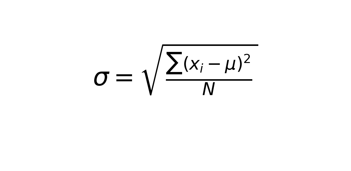
where:
- xi is each individual value.
- μ is the population mean.
- n is the total number of values.
The formula for the sample standard deviation (s) is slightly different. We divide by n-1 instead of n to get a more accurate estimate of the population standard deviation.
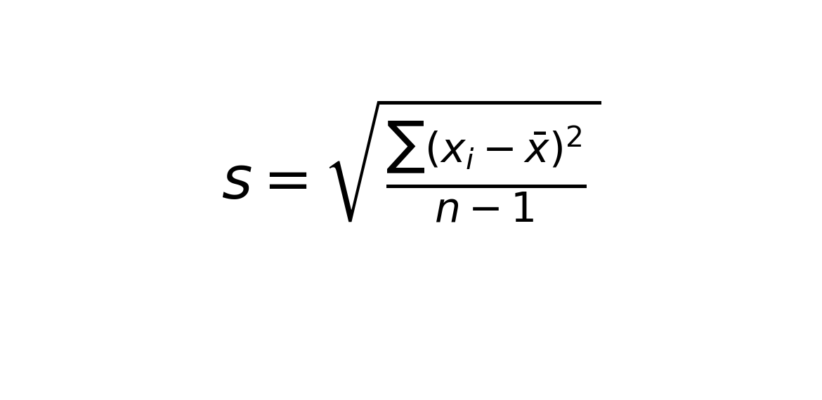
where:
- x̄ is the sample mean.
- n is the number of values in the sample.
In summary, here are the symbols you should be aware of:
Statistic (from a sample):
- Mean: x̄
- Standard Deviation: s
Parameter (from a population):
- Mean: μ
- Standard Deviation: σ
Like the mean, the standard deviation and range are sensitive to outliers. In most cases, outliers are anomalies and should be removed from calculations, but only after careful investigation to confirm they are indeed erroneous data.
In our Titanic data, the "age" column does not appear to have any significant outliers. A valid age would be between 0 and a reasonable upper limit, like 100. If you were to find a negative age or an age over 150, you could confidently conclude it is an error and remove it from your calculations.
Summary statistics are often visualized using a box-and-whisker plot.