Why Diagrams?
A good picture is worth a thousand words.
Humans are visual creatures. We can recognize patterns in diagrams and graphs far more quickly than we can by reading the same information in text. The human eye is excellent at identifying differences in placement, size, and color, making visual representation a powerful tool for data analysis.
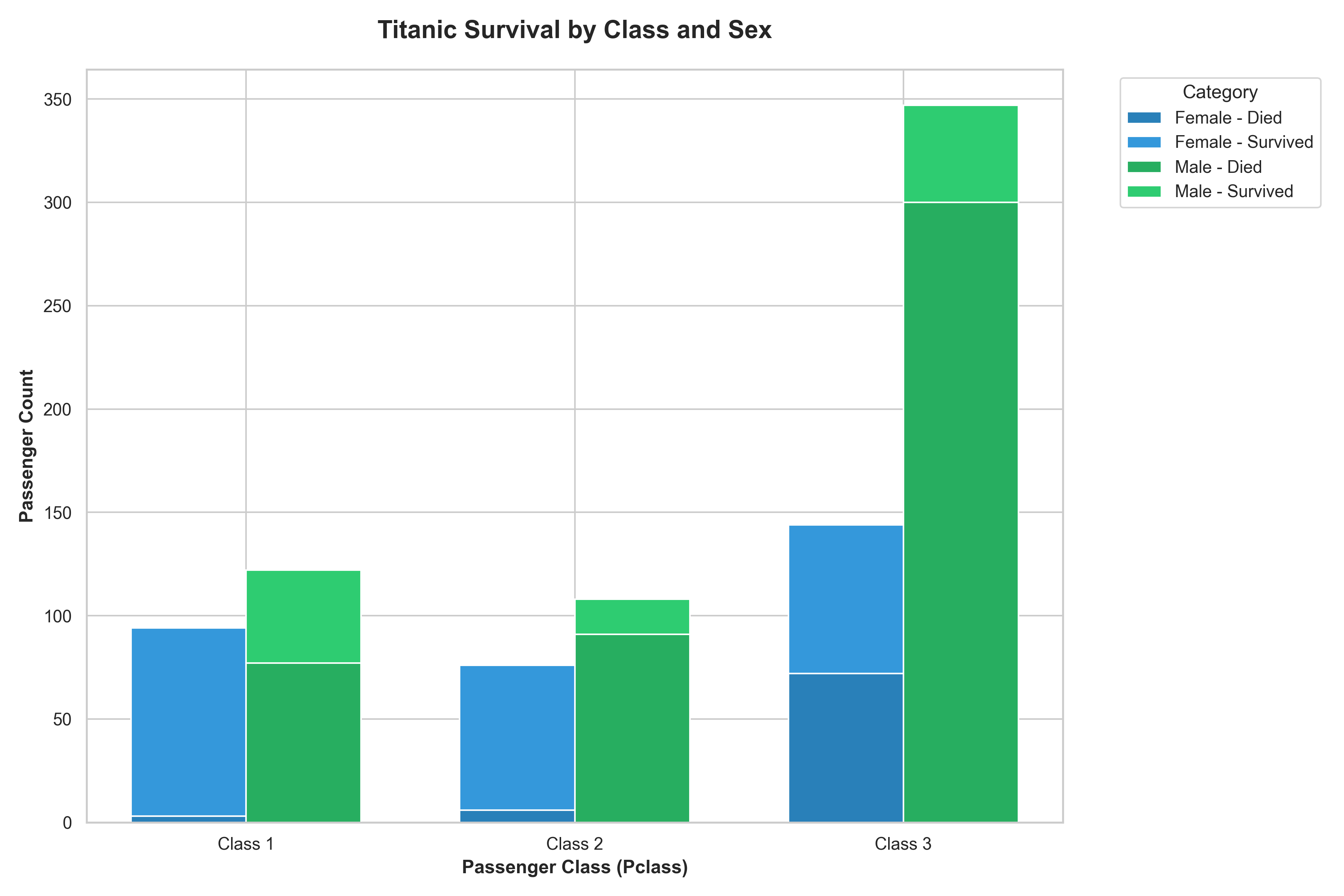
The chart above is a good example of how a well-designed, albeit complex, bar chart can convey a lot of information about the Titanic survivors across multiple categories (gender, class, and survival status).
Choosing the Right Chart: A Guide
The right chart can reveal insights and tell a clear story, while the wrong one can confuse or even mislead. This guide covers common chart types and provides examples of their good and bad usage.
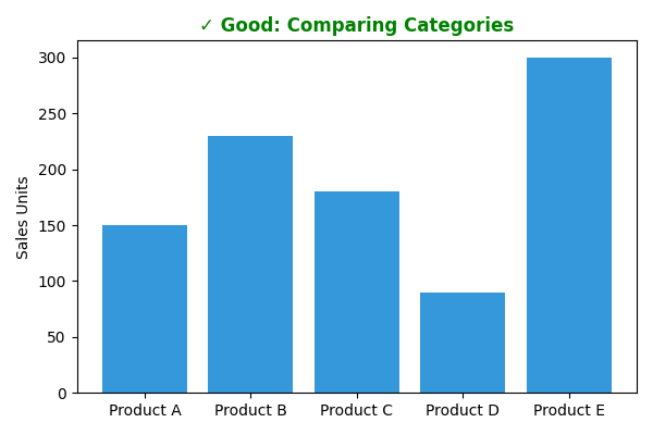
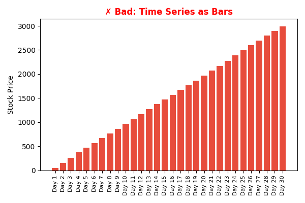
1. Bar Charts
Use For: Comparing numerical values across discrete categories.
- ✓ Good Example: Comparing sales figures for a few distinct products. The category is on one axis, and the numerical value is on the other, making comparison straightforward.
- ✗ Bad Example: Showing a trend over many continuous time periods (e.g., daily stock prices for a year). A line chart is far better for this.
Data Example:
| Good Data (Categorical) | Bad Data (Time Series) |
|---|---|
| Product A: 150 | Day 1: 100.0 |
| Product B: 230 | Day 2: 104.2 |
| Product C: 180 | Day 3: 102.1 |
| Product D: 90 | ... |
| Product E: 300 | Day 30: 115.5 |
| Good Diagram | Bad Diagram |
|---|---|
 |
 |
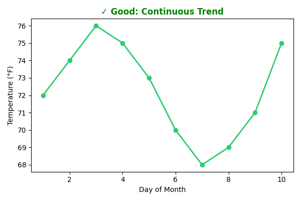
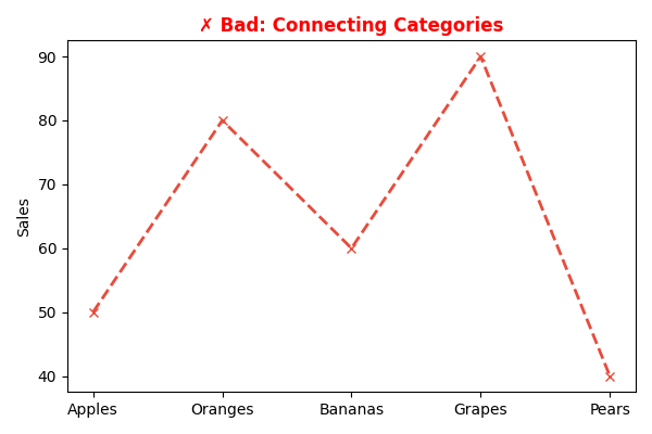
2. Line Charts
Use For: Displaying the change of a continuous variable over time.
- ✓ Good Example: Tracking stock prices or temperature changes over a month. The line clearly shows trends, peaks, and troughs.
- ✗ Bad Example: Comparing unordered categories like sales for "Apples," "Oranges," and "Bananas." The connecting line implies a relationship that doesn't exist.
Data Example:
| Good Data (Continuous) | Bad Data (Categorical) |
|---|---|
| Day 1: 72°F | Apples: 50 |
| Day 2: 74°F | Oranges: 80 |
| Day 3: 76°F | Bananas: 60 |
| ... | Grapes: 90 |
| Day 10: 75°F | Pears: 40 |
| Good Diagram | Bad Diagram |
|---|---|
 |
 |
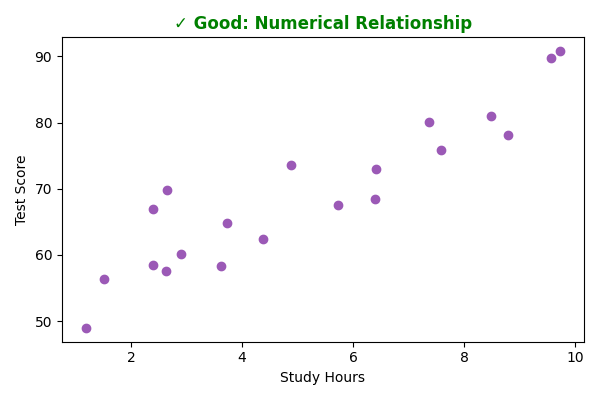
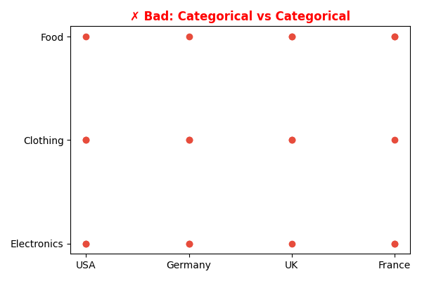
3. Scatter Plots
Use For: Showing the relationship and potential correlation between two numerical variables.
- ✓ Good Example: Plotting "Study Hours vs. GPA" to see if they are related. Each point represents a single student.
- ✗ Bad Example: Plotting categorical data like "Country" vs. "Product Category." The result would be meaningless.
Data Example:
| Good Data (Numerical vs Numerical) | Bad Data (Categorical vs Categorical) |
|---|---|
| 2.5 hrs -> Score: 60 | USA -> Electronics |
| 5.0 hrs -> Score: 75 | UK -> Clothing |
| 8.0 hrs -> Score: 92 | France -> Food |
| ... | ... |
| Good Diagram | Bad Diagram |
|---|---|
 |
 |
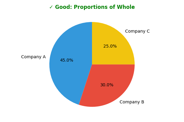
4. Pie and Donut Charts
Use For: Showing the proportions of a single whole. Best used with a small number of categories (ideally 5 or fewer).
- ✓ Good Example: Displaying the market share of three dominant companies in an industry.
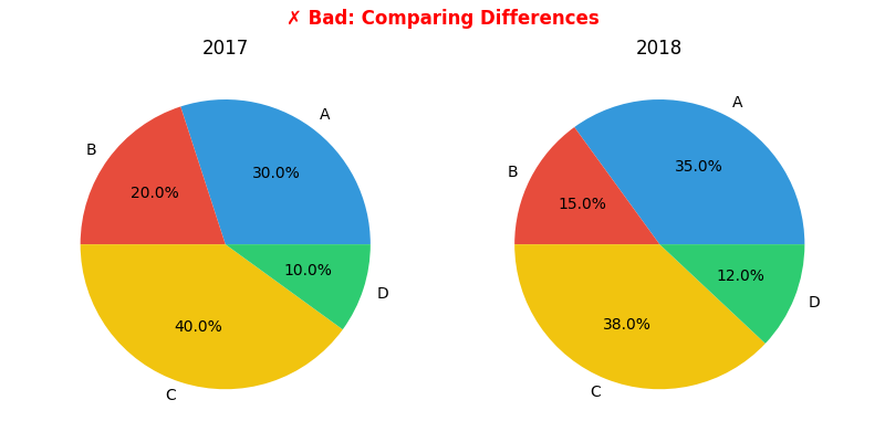
- ✗ Bad Example: Comparing data across two different groups (e.g., market share in 2017 vs. 2018). It is very difficult for the human eye to compare the angles and areas of two separate pie charts. A bar chart is much more effective for this.
Data Example:
| Good Data (Proportions) | Bad Data (Comparison) |
|---|---|
| Company A: 45% | 2017: A=30%, B=20%... |
| Company B: 30% | 2018: A=35%, B=15%... |
| Company C: 25% | (Hard to compare visual changes) |
| Good Diagram | Bad Diagram |
|---|---|
 |
 |
5. Histograms
Use For: Showing the distribution of a single numerical variable.
- Binning is Key: The number and size of bins can significantly affect how the distribution is interpreted.
- Rule of Thumb: Choose between 5 and 20 bins. Larger datasets generally benefit from more bins.
- Boundaries: Use whole numbers for bin boundaries whenever possible to make the chart easier to read.
General Best Practices
- Avoid Clutter: Don't add unnecessary gridlines, backgrounds, or 3D effects. These often distract from the data. A simple 2D chart is almost always clearer.
- Show Data Accurately: Be mindful that not starting a bar chart's y-axis at 0 can graphically exaggerate differences.
- Use Color Purposefully: Use different colors only when they correspond to meaningful differences in the data. To ensure accessibility, avoid using combinations of red and green.
- Label Clearly: Ensure your axes, title, and legend are clear and descriptive.