Accuracy Measurement in Classification
After training a classification model, how do we know if it's any good? We need metrics to measure its performance. For classification tasks, the most fundamental tool for evaluation is the Confusion Matrix.
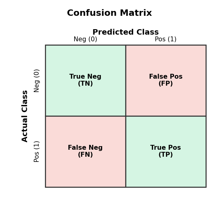
The Confusion Matrix
A confusion matrix is a table that summarizes the performance of a classification model by comparing its predictions to the actual outcomes.
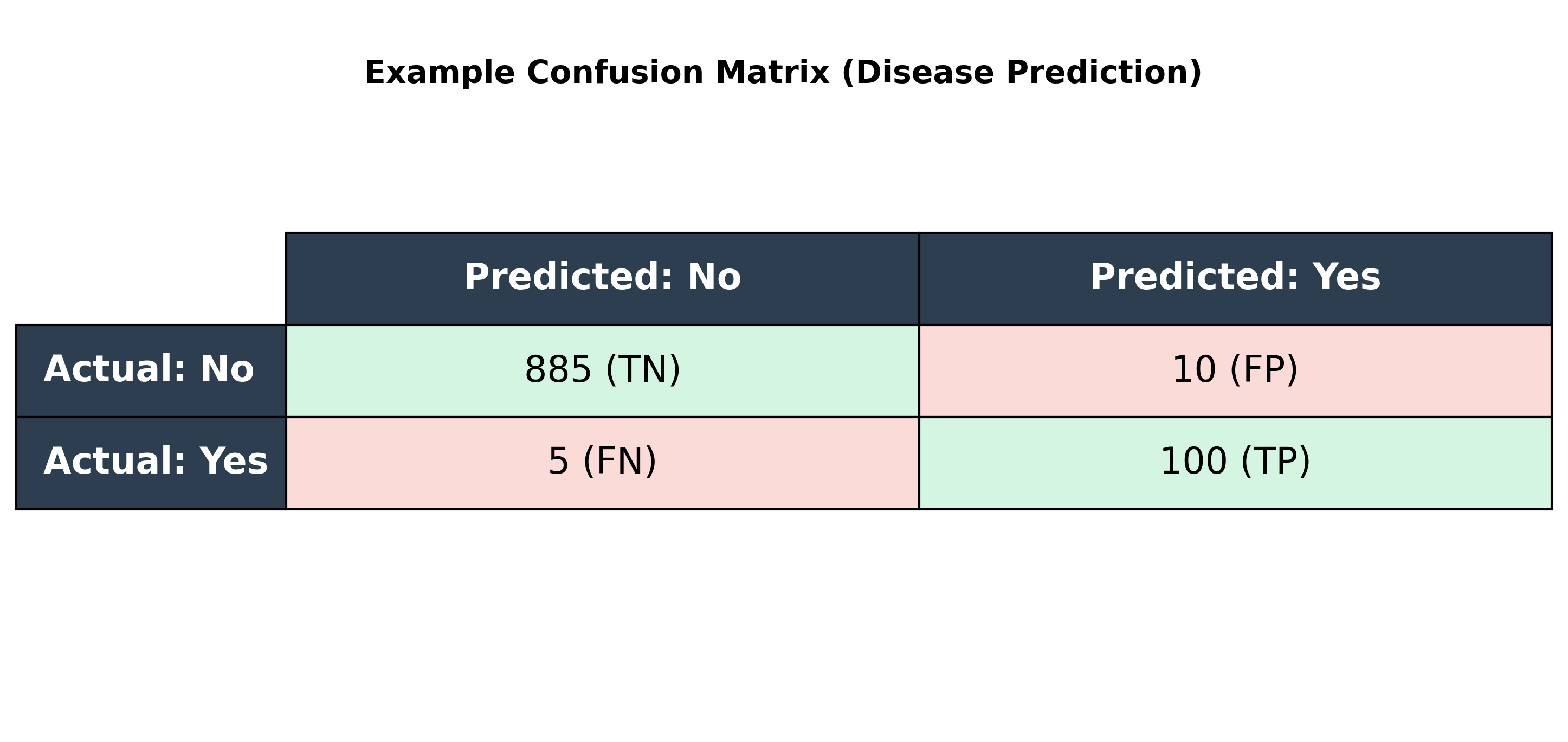
Let's use a standard example: a model that predicts whether a patient has a disease.
- True Positive (TP): The patient has the disease, and the model correctly predicts 'Yes'.
- False Positive (FP) (Type I Error): The patient does not have the disease, but the model incorrectly predicts 'Yes'. (A false alarm).
- False Negative (FN) (Type II Error): The patient has the disease, but the model incorrectly predicts 'No'. (A dangerous miss).
- True Negative (TN): The patient does not have the disease, and the model correctly predicts 'No'.
This is typically arranged in a table:
Core Metrics Derived from the Confusion Matrix
From the four values in the confusion matrix, we can calculate several key performance metrics.
Accuracy
Accuracy measures the overall correctness of the model.
- Formula:
(TP + TN) / (TP + FP + FN + TN) - Intuition: What fraction of predictions did our model get right?
- The Accuracy Paradox: Accuracy can be misleading, especially with imbalanced datasets. If a disease affects only 1% of the population, a model that always predicts 'No Disease' will be 99% accurate but completely useless. This is why we need other metrics.
Precision
Precision measures the quality of the positive predictions.
- Formula:
TP / (TP + FP) - Intuition: Of all the patients the model flagged as having the disease, what percentage actually had it?
- When to use: High precision is important when the cost of a False Positive is high (e.g., sending a critical non-spam email to the spam folder).
Recall (or Sensitivity)
Recall measures the model's ability to find all the actual positive cases.
- Formula:
TP / (TP + FN) - Intuition: Of all the patients who actually had the disease, what percentage did the model correctly identify?
- When to use: High recall is important when the cost of a False Negative is high (e.g., failing to detect a serious disease).
F1-Score
The F1-Score is the harmonic mean of Precision and Recall. It provides a single metric that balances both concerns.
- Formula:
2 * (Precision * Recall) / (Precision + Recall) - When to use: It's useful when you need a balance between Precision and Recall and there's an uneven class distribution.
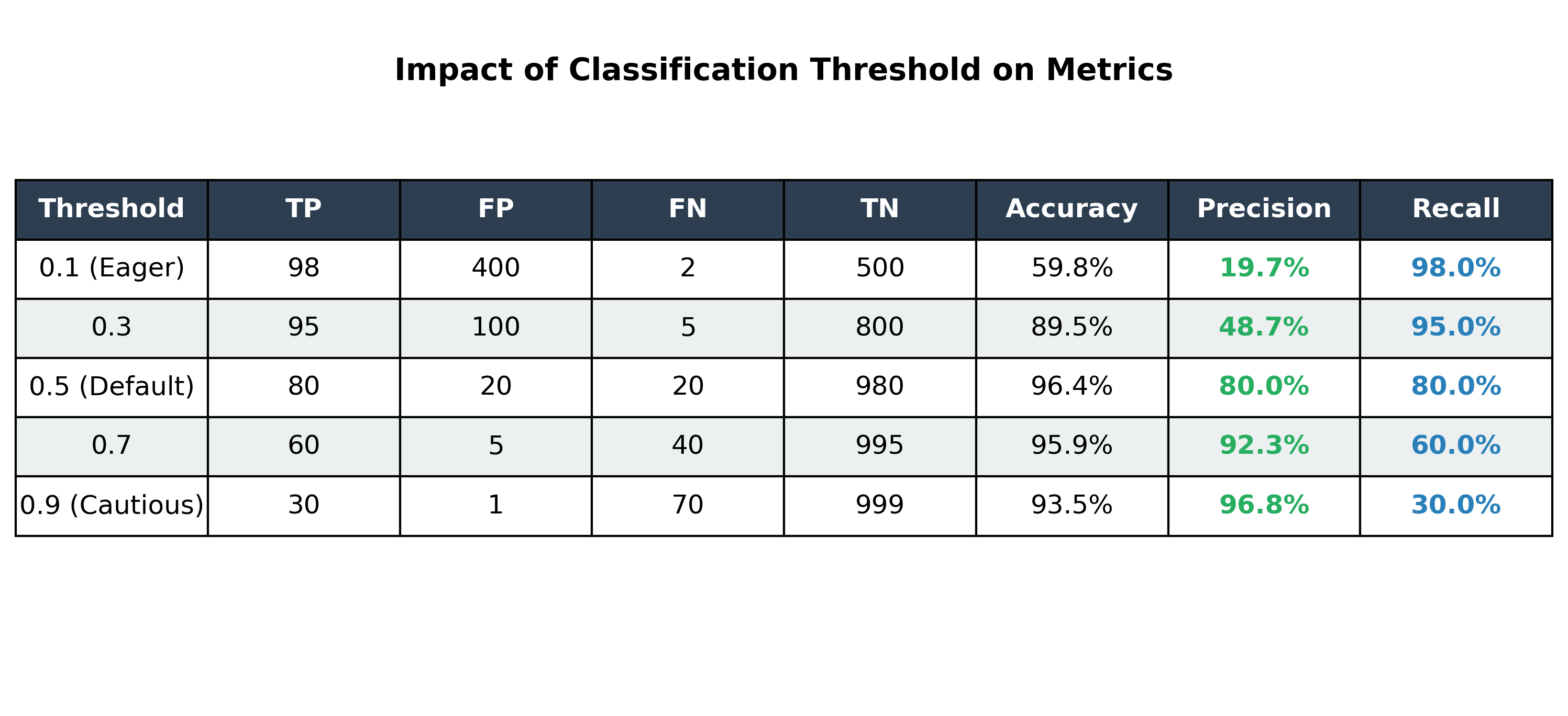
The Precision-Recall Trade-off and the Classification Threshold
Most classification models output a probability (e.g., 0.87 probability of having the disease). We use a threshold (or cutoff) to turn this probability into a final class prediction. The default is usually 0.5.
By changing this threshold, we can trade Precision for Recall and vice versa:
- Increasing the threshold (e.g., to 0.9) makes the model more 'cautious'. It will only predict 'Yes' when it's very confident. This increases Precision but decreases Recall.
- Decreasing the threshold (e.g., to 0.1) makes the model more 'eager' to predict 'Yes'. This increases Recall but decreases Precision.
Visualizing Model Performance
Beyond simple tables, we use specific curves to visualize how our model handles the trade-offs between different metrics as we change the classification threshold.
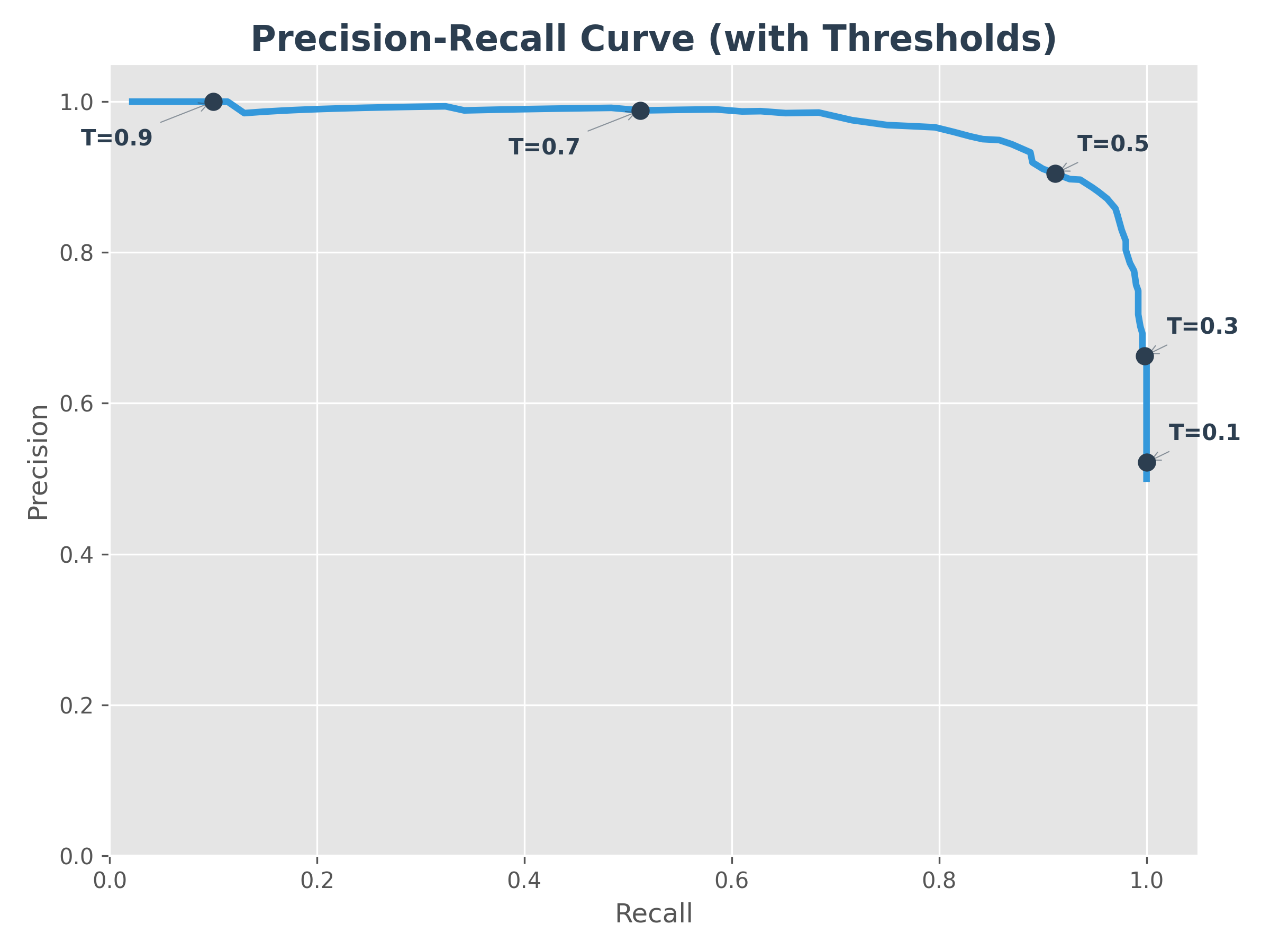
1. Precision-Recall Curve
The Precision-Recall (P-R) curve shows the relationship between precision and recall for every possible threshold. The markers (T=0.1, 0.3, etc.) show how the model moves along the curve as you change the threshold.
- Goal: A perfect model would be in the top-right corner (100% precision and 100% recall).
- Intuition: As you try to "catch" more positive cases (higher recall), you inevitably start catching some false alarms (lower precision).
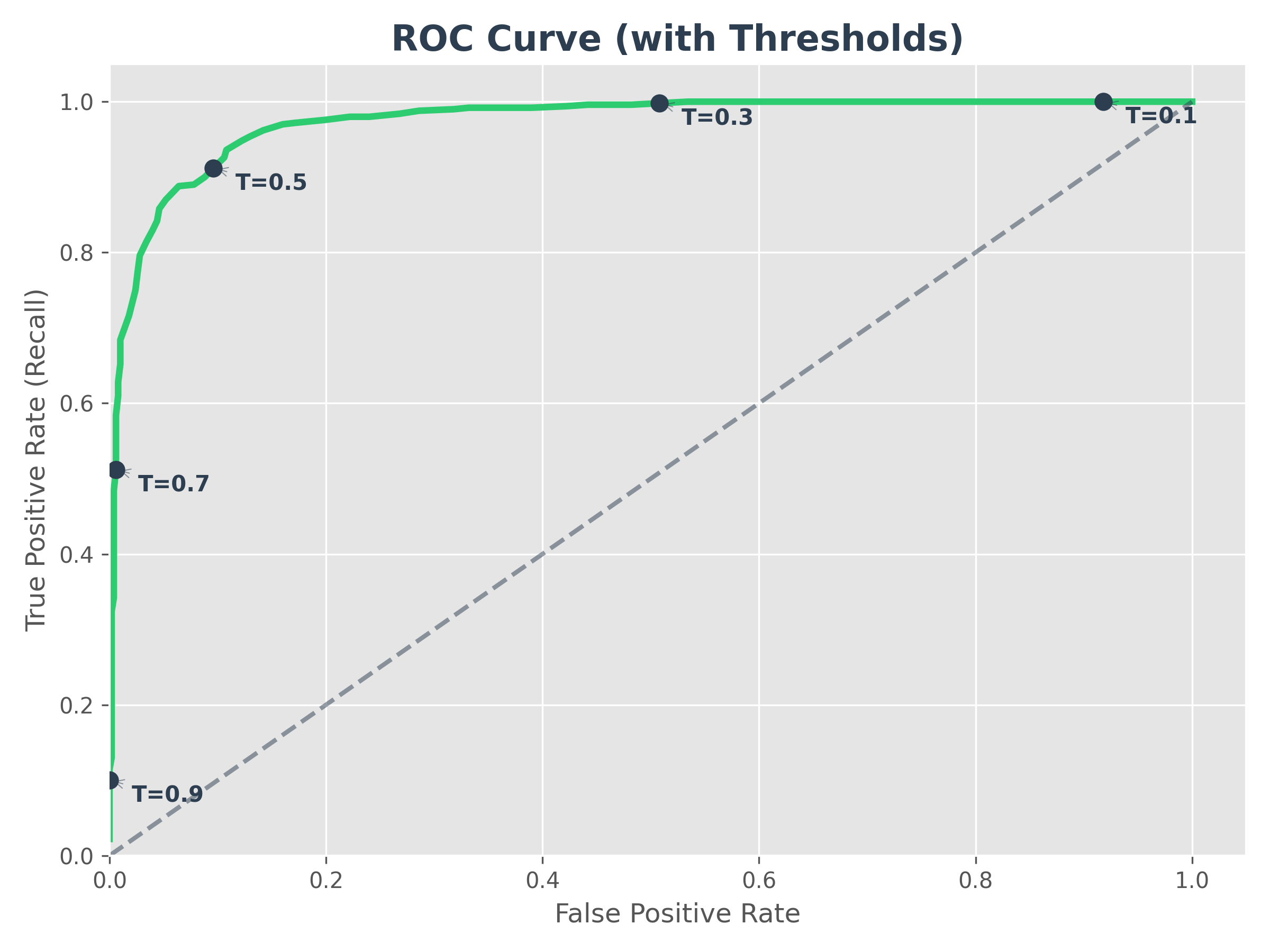
2. ROC Curve (Receiver Operating Characteristic)
The ROC curve plots the True Positive Rate (Recall) against the False Positive Rate (FPR). Like the P-R curve, the markers show the trade-off at different thresholds.
- FPR Formula:
FP / (FP + TN)(What fraction of negative cases did we wrongly flag as positive?) - AUC (Area Under the Curve): This is a single number that summarizes the ROC curve. An AUC of 1.0 is perfect, while 0.5 means the model is no better than random guessing (the diagonal dashed line).
- Intuition: It tells us how good the model is at distinguishing between the two classes.
💡 ROC vs. AUC: What's the difference? They use the exact same graph, but they focus on different things:
- ROC (The Curve): Is the Line. Use it to pick your final threshold (the "dot" on the line).
- AUC (The Area): Is the Space under the line. Use it to compare which model is better overall.
Understanding the AUC Score
To understand the AUC score, think of the graph as a unit square.
- The X-axis (False Alarms) goes from 0 to 1.
- The Y-axis (Successful Catches) goes from 0 to 1.
- The total area of this square is 1.0 ().
When we say a model has an AUC of 0.90, we are literally saying that the curve it creates covers 90% of the possible area of that square. The more "area" the model covers, the better it is at separating the two classes without making mistakes.
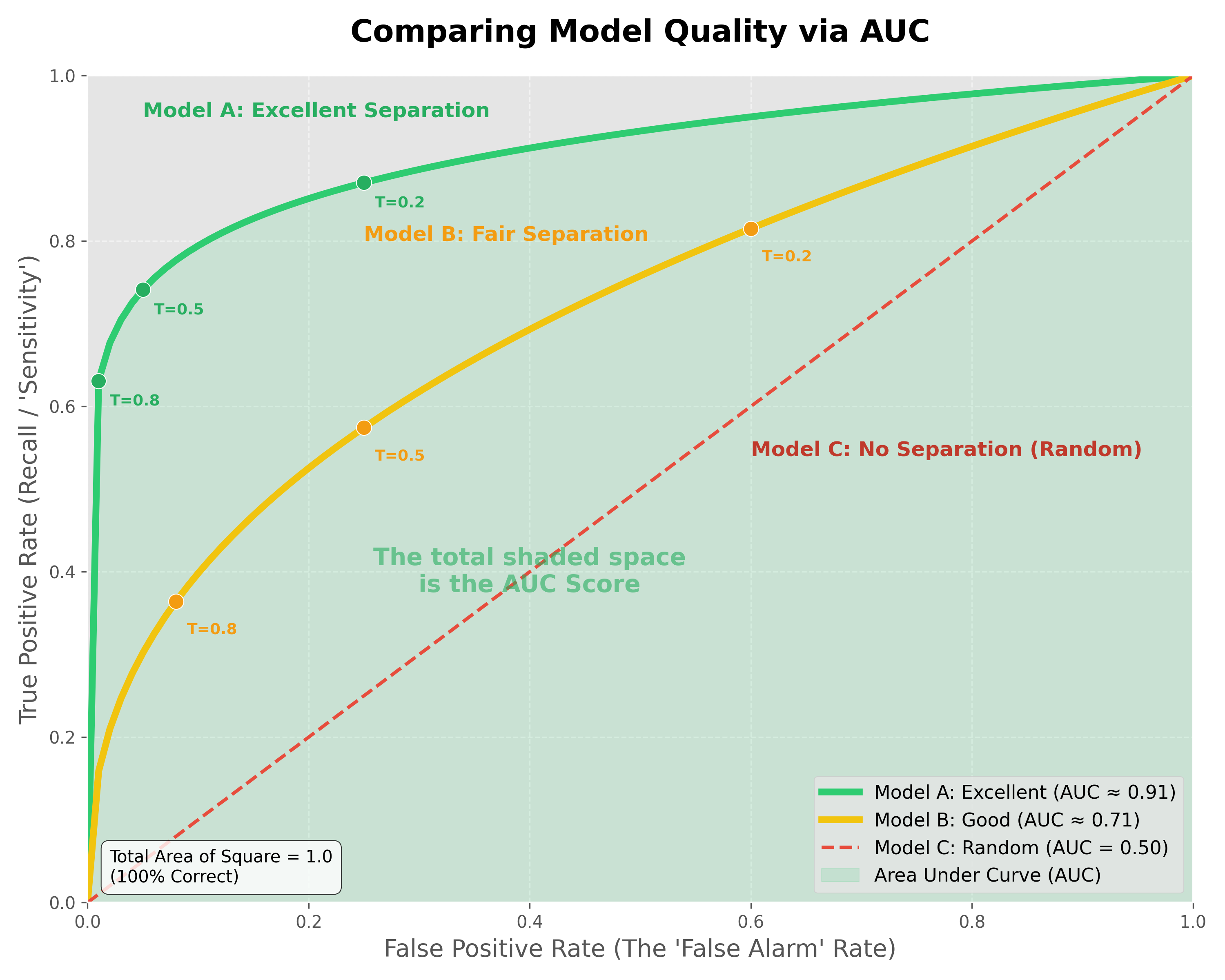
Comparing Model Quality:
- Model A (Excellent - AUC ≈ 0.9): The curve "hugs" the top-left corner. It can achieve very high recall (catching almost all positives) while maintaining a very low false alarm rate.
- Model B (Good/Fair - AUC ≈ 0.7): The curve is less aggressive. To catch most of the positives, you will have to accept a significant number of false alarms.
- Model C (Random - AUC = 0.5): The model has no "separation power." It is essentially guessing, and you are just as likely to get a false alarm as you are a correct catch.
Why look at the ROC Curve and AUC if we only deploy one threshold?
- The ROC Curve is your "Menu of Options." Even though you only deploy one point (one threshold), you need the full curve to see which point gives you the best balance for your specific business needs.
- The AUC is the "Engine's Power." It proves that the model is high-quality across the board. A model with a higher AUC gives you a "better menu" to choose from. Once you have a high-AUC model, you use the ROC line to pick your final "speed" (threshold) for deployment.
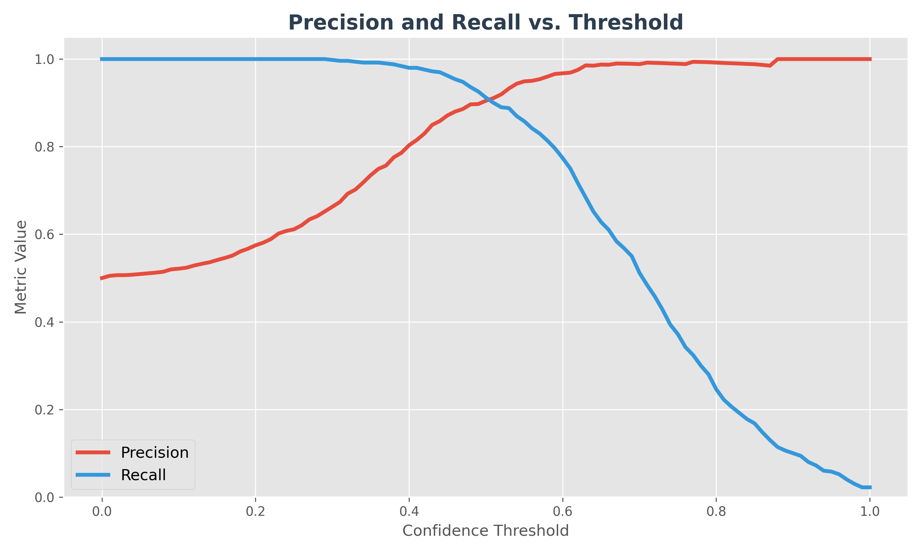
3. Precision & Recall vs. Threshold
This diagram shows how both metrics change as you slide your "confidence threshold" from 0 to 1.
- Low Threshold: You are "eager" to say Yes. Recall is high, but Precision is low.
- High Threshold: You are "cautious". Precision is high, but you miss many cases, so Recall is low.
- The Sweet Spot: The intersection point is often a good starting threshold, but the "best" one depends on your specific business cost (e.g., is a miss worse than a false alarm?).
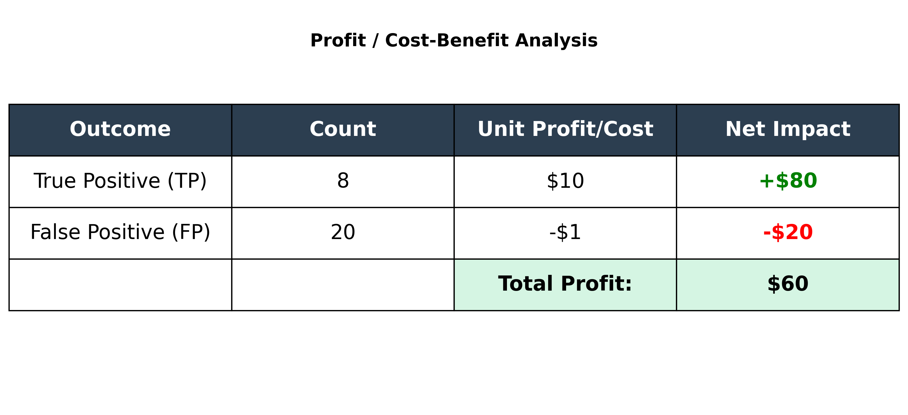
Beyond Accuracy: The Cost of Errors
Sometimes, the business impact of an error is more important than the raw accuracy. This is called cost-benefit analysis.
Let's take an example: Sending promotional offers to 1000 people, where the response rate is 1% (10 people).
- Sending a mailer costs $1.
- A successful response (a sale) generates $10 profit.
Consider this confusion matrix:

The model's accuracy is (8 + 970) / 1000 = 97.8%, which seems high. But let's look at the profit:
- Profit from True Positives: 8 people responded, so
8 * $10 = $80. - Cost of False Positives: We sent mailers to 20 people who didn't respond, so
20 * $1 = $20cost. - Total Profit:
$80 - $20 = $60.
The model correctly identified 8 of the 10 potential responders, generating $60 in profit. This analysis is often more valuable than accuracy alone.
Evaluation for Multiclass and Regression Models
- Multiclass Classification: The confusion matrix will be larger (NxN for N classes), but the same core concepts apply. Metrics like precision, recall, and F1-score can be calculated for each class and then averaged (e.g., using macro or micro averaging).
- Regression Models: As a reminder, regression models (which predict continuous values) are evaluated using different metrics, such as Root Mean Squared Error (RMSE) and Mean Absolute Error (MAE), as discussed in the previous chapter.