Visualizations with Seaborn
What is Seaborn?
The end result of most data analysis is the visualization of findings with beautiful diagrams. Seaborn is an open-source Python library used for visualizations. Seaborn is especially friendly with a Pandas DataFrame, and as an analyst, you will find working with Seaborn easier compared to Matplotlib.
Seaborn is built on top of Matplotlib, just like Pandas is built on NumPy. Just like Pandas, Seaborn provides us with powerful, higher-level functions to create diagrams.
In this example, we will import Seaborn to make use of its ready-made datasets. Seaborn is also already installed with Anaconda, so you are all set to import the library when you are using Anaconda. It is also available in the Colab environment. When you import the library, you get access to many datasets that are part of the library. One such dataset is the famous Titanic data. This is sample data of the travelers in the Titanic ship disaster. If you are curious to know the other datasets that come with Seaborn, here is the GitHub link: https://github.com/mwaskom/seaborn-data.
Let's now load the Titanic dataset in our notebook:
Load a built-in dataset
import seaborn as sns

titanic = sns.load_dataset("titanic")
print(type(titanic))
Output
<class 'pandas.core.frame.DataFrame'>
The standard alias for Seaborn is sns. You will notice that the load_dataset method on sns returns a Pandas
DataFrame object.
Simple, single-variant charts are really easy to create using Matplotlib. Pandas functions on DataFrames use Matplotlib underneath. But if you want to plot multi-variant charts or if you want to add more sophistication with a few lines of code, Seaborn is the way to go.
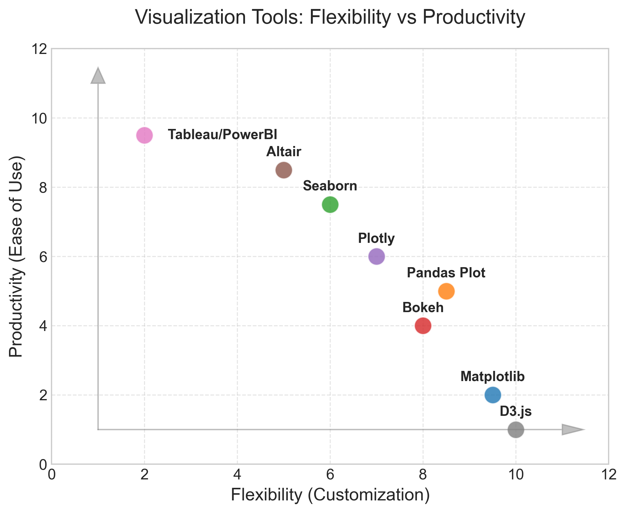
While Seaborn improves your productivity, it comes at the cost of flexibility. Here is a chart that depicts the many different popular visualization tools and where they stand with respect to flexibility and productivity:
In this lesson, we will continue plotting the Titanic data but using Seaborn. For most of the Seaborn functions, we just feed the DataFrame object to function calls and set the various variable arguments and/or keyword arguments for tweaking the default graphs and charts.
FacetGrid
If you want to show the distribution of 'age' over multiple facets, like the survived and class columns, with separate diagrams for each distinct value of each facet, you would write just three lines of code in Seaborn, as shown below:
g = sns.FacetGrid(
    titanic, row="survived", col="class", margin_titles=True, height=3, aspect=1.5
)
g.map(sns.histplot, "age", color="#3498db")
g.fig.subplots_adjust(top=0.9)
g.fig.suptitle("Age Distribution by Class and Survival", fontsize=16)
Output:
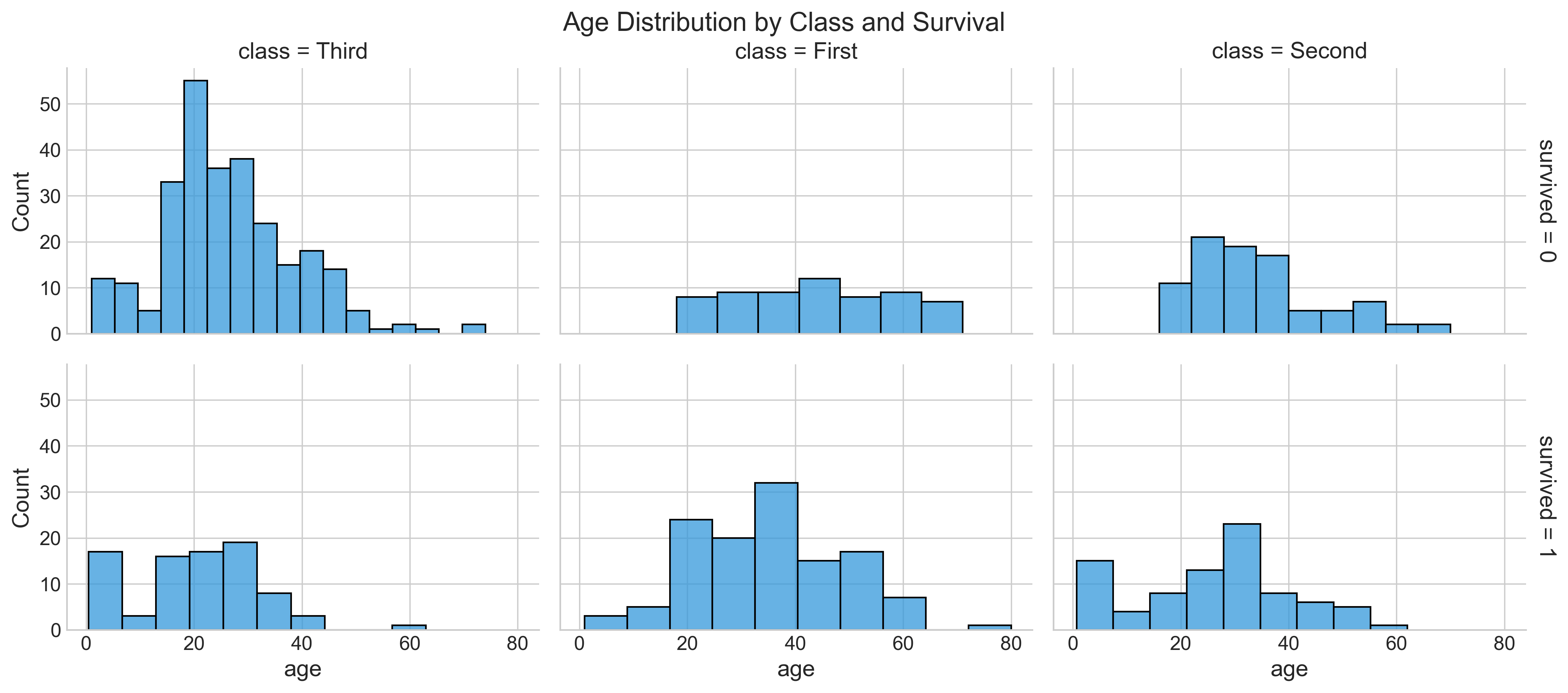
The histplot function calculates the distribution of age by counting the number of observations that fall within discrete bins.
To see a box plot instead of a distplot, you can change the map parameter, as in the example below:
g = sns.FacetGrid(titanic, row="survived", col="class")
g.map(sns.boxplot, "age")
You can also just plot the histogram by referencing the hist type from plt, as shown below:
import matplotlib.pyplot as plt

sns.set_style(style="whitegrid")
g = sns.FacetGrid(
    titanic, col="survived", row="pclass", height=2.5, aspect=1.6, margin_titles=True
)
g.map(plt.hist, "age", alpha=0.6, bins=20, color="#e74c3c")
g.fig.subplots_adjust(top=0.9)
g.fig.suptitle("Survival by Pclass (Matplotlib Hist)", fontsize=16)
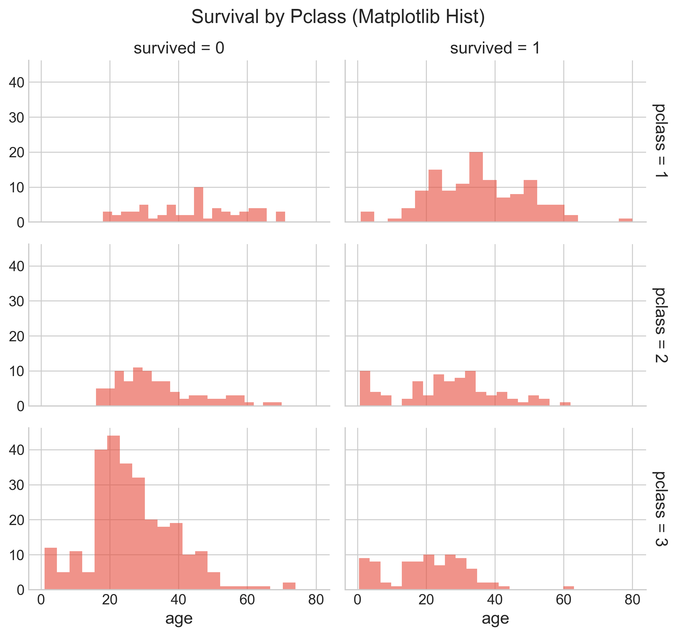
From this, you can notice that the best chance of survival was in 1st class, and the least chance of survival was in 3rd class.
To learn more about the variable keyword arguments that are set, refer to: https://seaborn.pydata.org/generated/seaborn.FacetGrid.html#seaborn.FacetGrid
Applying just the distplot
Although drawing a histogram from Pandas is much easier, Seaborn also provides a wrapper to draw a histogram of a density plot, as shown below:
sns.distplot(titanic["age"].dropna(), bins=10, color="g")
In the example above, we dropped all the na values before plotting. If na values are not dropped, then while computing the KDE, it will throw an error, even though you may see the plot.
While 'g' stands for green, 'b' stands for blue, etc., when set as a value for the color attribute, you can also use standard hexadecimal colors. Here is an example of using a hex color:
sns.distplot(titanic['age'].dropna(), bins=10, color='#FF5733')
Bar chart
You can create a bar plot with pclass on the x-axis and the y-axis showing the mean survived value, with a hue on sex, with just one line of code, as below:
plt.figure(figsize=(10, 6))
ax = sns.barplot(
    x="pclass",
    y="survived",
    hue="sex",
    data=titanic,
    palette="muted",
    errorbar=("ci", 95),
)
ax.set_title("Survival Rate by Class and Sex", pad=20, fontsize=16)
ax.set_ylabel("Survival Probability")
Output:
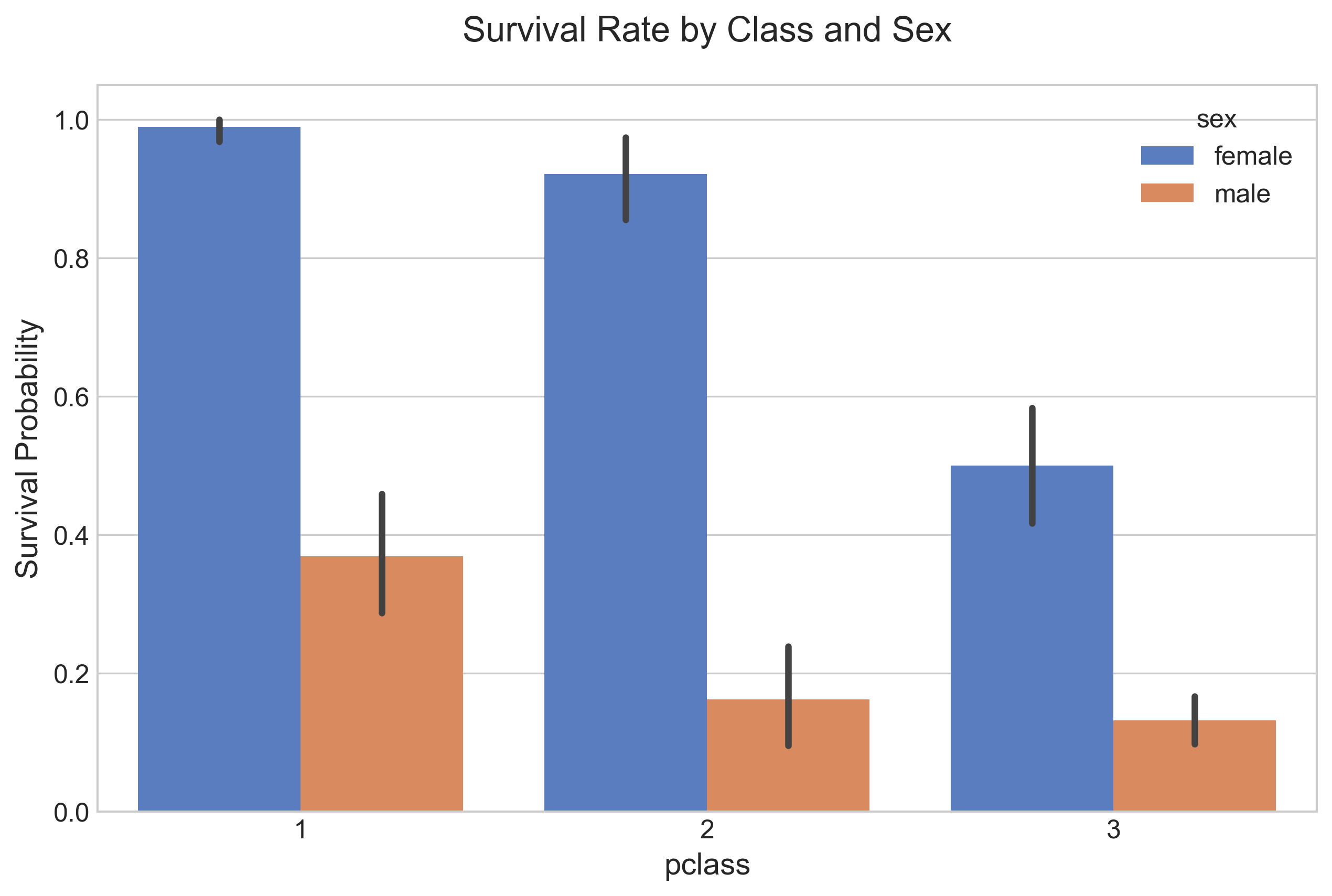
The bar height is equal to the average value of survived for the specific split. We note from the chart that females had a better chance of survival in this tragedy, no matter which pclass they belonged to, compared to males in the same class. Females and males in 1st class had a better chance of survival compared to other classes. The hue option enables you to split and show data by an additional categorical value.
You also see the standard error bar (confidence interval) in these charts. The error bars represent the variability of the data and indicate the error or uncertainty in a reported measurement. Error bars can also be expressed with a plus-minus sign (±), representing the upper and lower limit of the error.
Since this is a sample dataset and not the entire population, having a confidence interval bar is appropriate. Pandas calculates that automatically by taking multiple samples to derive the line.
References:
However, if this were the entire population data, you would want to remove this error line. To do that, you just add another parameter, errorbar=None, and the revised code would be:
sns.barplot(x="pclass", y="survived", hue="sex", data=titanic, errorbar=None).set_title("Class-wise survivors")
More on CI here: https://towardsdatascience.com/a-very-friendly-introduction-to-confidence-intervals-9add126e714
Cat Plot
To show the relationship between a numerical and one or more categorical variables, you can use catplot.
To show the categories sex, survived, and pclass with the numerical value age, you would use a catplot as shown below:
g = sns.catplot(
    x="sex",
    y="age",
    hue="survived",
    col="pclass",
    data=titanic,
    kind="bar",
    height=4,
    aspect=0.7,
    palette="Set2",
    errorbar=None,
)
g.fig.subplots_adjust(top=0.85)
g.fig.suptitle("Average Age by Sex, Class, and Survival", fontsize=16)
Output:
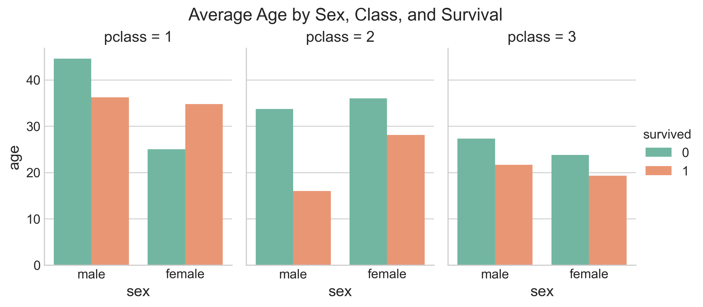
You also see a few extra parameters here: height sets the height in inches for each facet; aspect sets the aspect ratio of each facet, so that aspect * height gives the width of each facet in inches. There are many more parameters you can set; reference: https://seaborn.pydata.org/generated/seaborn.catplot.html#seaborn.catplot
Heat Maps
Another very useful function in Seaborn is the ability to generate heat maps. Supposing you want to draw a heat map with correlation coefficients between all numerical columns for your Titanic data and see which of the variables are strongly or weakly correlated, you would write the code below:
import pandas as pd
import numpy as np

# Select numerical columns only
numeric_cols = titanic.select_dtypes(include=[np.number])
corr = numeric_cols.corr()

plt.figure(figsize=(10, 8))
sns.heatmap(
    corr,
    vmin=-1,
    vmax=1,
    center=0,
    cmap=sns.diverging_palette(220, 20, n=200),
    annot=True,
    fmt=".2f",
    square=True,
)
plt.title("Correlation Matrix", pad=20)
Output:
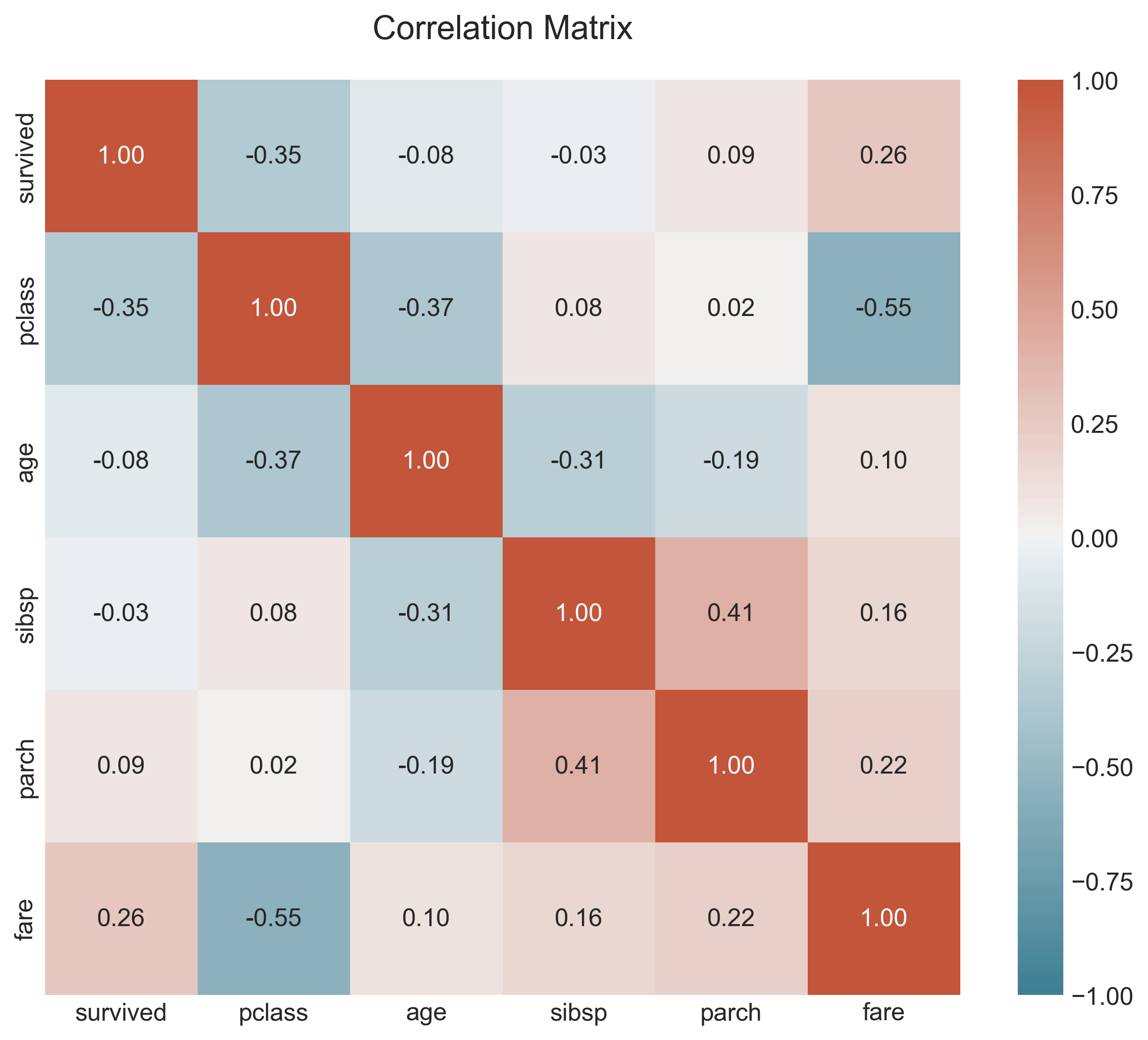
From the heat map, we see that there is a negative correlation between survived and pclass, and a slightly positive correlation between survived and fare. It is also interesting to see the other correlations.
Uses in ML
- While this eBook does not cover ML models, it is still important to note that a correlation matrix can be used to select the features to construct your ML model. Weakly correlated predictors to the target variable can be dropped, and heavily correlated variables can be selected as features for your model.
References:
- https://seaborn.pydata.org/generated/seaborn.diverging_palette.html
- https://seaborn.pydata.org/generated/seaborn.heatmap.html
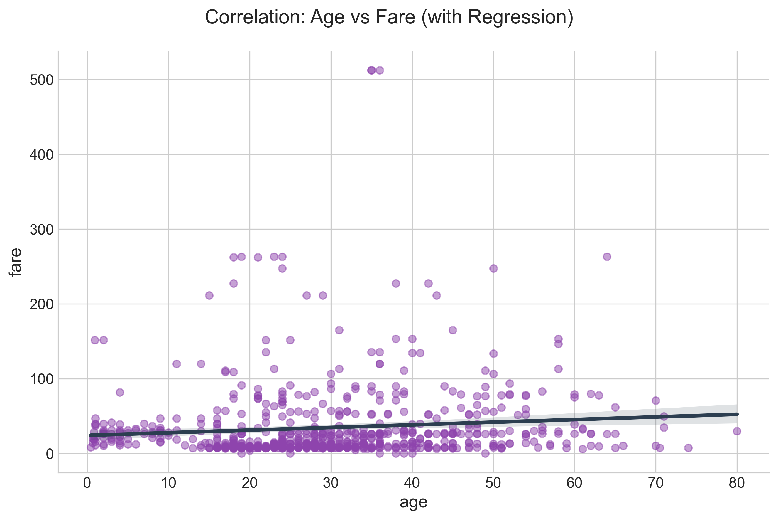
LM Plot
An lmplot is intended as a hybrid to fit regression models across conditional subsets of a dataset. It combines regplot and FacetGrid.
To see the correlation between fare and age with a regression line, here is the code:
g = sns.lmplot(
    x="age",
    y="fare",
    data=titanic,
    height=6,
    aspect=1.5,
    scatter_kws={"alpha": 0.5, "color": "#8e44ad"},
    line_kws={"color": "#2c3e50"},
)
g.fig.subplots_adjust(top=0.9)
g.fig.suptitle("Correlation: Age vs Fare (with Regression)", fontsize=16)
Output:
CountPlot
With countplot, you can get a total count of individual category types. Here is an example. In this example, you can get the count of all offense categories in one plot. Note that the labels are rotated and the font size is set to ensure that the labels do not overlap.
import pandas as pd
import seaborn as sns
import matplotlib.pyplot as plt

demolitions = pd.read_csv(
    "https://raw.githubusercontent.com/jravi123/datasets/refs/heads/main/datasets/Detroit_Demolitions_withColumns.csv"
)

plt.figure(figsize=(12, 8))
# Filter for 'Joy Community'
subset = demolitions[demolitions.Neighborhood == "Joy Community"]

# Get top contractors to keep plot clean
top_contractors = subset["Contractor Name"].value_counts().nlargest(10).index
subset = subset[subset["Contractor Name"].isin(top_contractors)]

ax = sns.countplot(
    x="Contractor Name", data=subset, palette="viridis", order=top_contractors
)
ax.set_xticklabels(ax.get_xticklabels(), rotation=45, ha="right", fontsize=10)
ax.set_title("Frequency of Demolitions by Contractor (Joy Community)", pad=20)
ax.set_xlabel("Contractor Name")
ax.set_ylabel("Count")
Output:
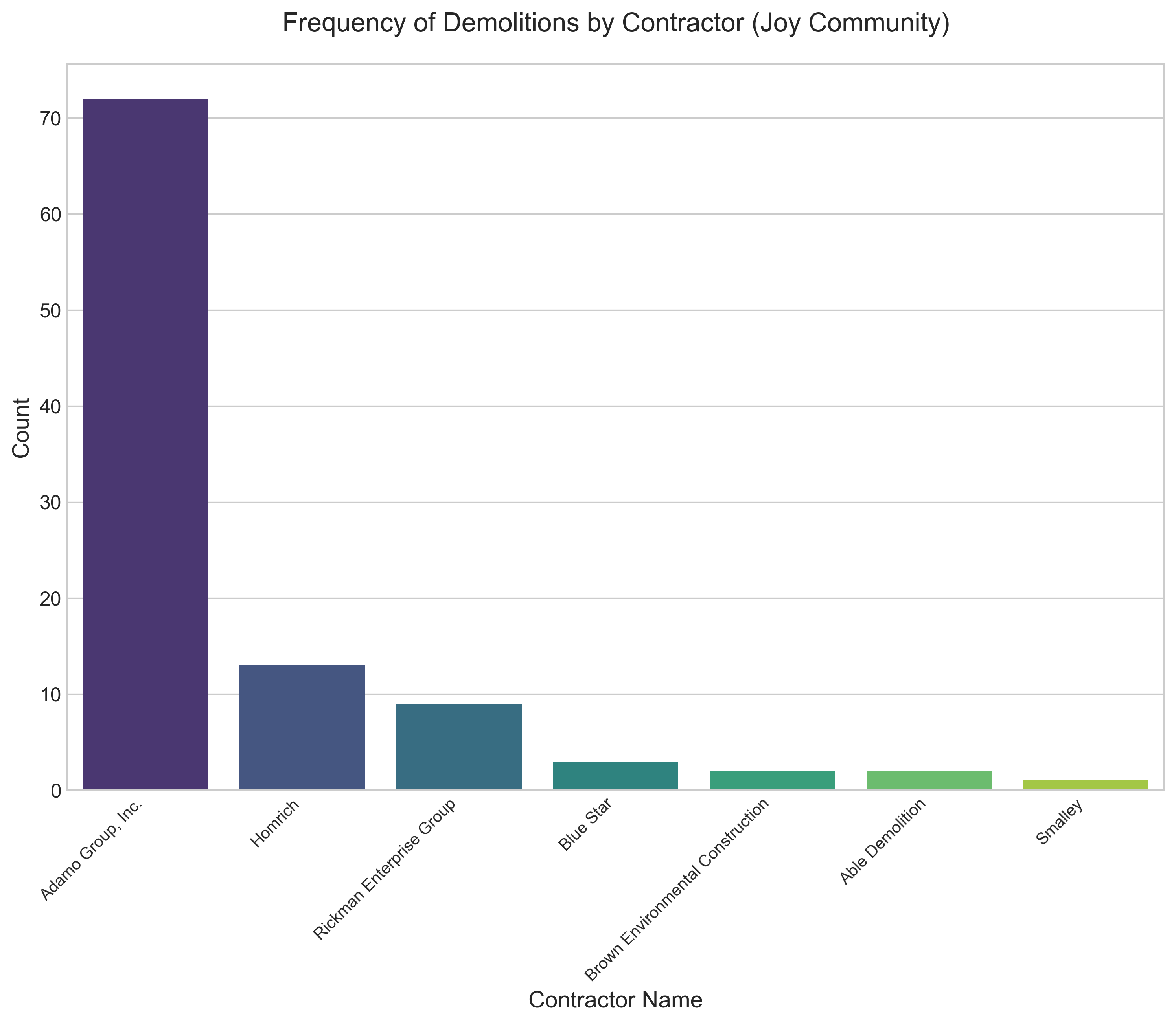
In the plot above, we have set a slew of parameters: rotation, fontsize, etc. We did this by first getting the handle of the subplot of the figure and then changing the default settings. You can also get a reference to the figure from the subplot. Once you have the figure object, you can change its size by setting the width and height in inches.
Notice that the palette parameter of countplot is set with a value of 'Set2', which represents a type of colormap. There are more options.
Reference:
- https://matplotlib.org/examples/color/colormaps_reference.html
- To change the style, refer to: https://seaborn.pydata.org/tutorial/aesthetics.html#seaborn-figure-styles
To plot pairwise relationships
To plot each pairwise relationship in one graph, use pairplot: https://seaborn.pydata.org/generated/seaborn.pairplot.html
Official reference
- Seaborn Tutorial: https://seaborn.pydata.org/tutorial.html#tutorial
- Change Default Theme - https://seaborn.pydata.org/generated/seaborn.set_theme.html#seaborn.set_theme