Other Popular Visualization Tools
There are many other popular Python-based libraries for visualization. Some are open-source projects, while a few others are proprietary.
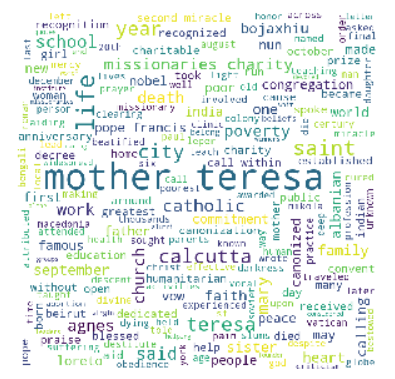
WordCloud
If you are analyzing a collection of words, the wordcloud package can be used to provide a pictorial representation of the frequency of words.
Here is an example of a text file containing the biography of Mother Teresa, which is read into a DataFrame. Then, a long string containing all the words in the file is constructed, which is then fed to the WordCloud generator to get us the pretty picture.
from wordcloud import WordCloud, STOPWORDS
import matplotlib.pyplot as plt
import pandas as pd

stopwords = set(STOPWORDS)
df = pd.read_table('https://raw.githubusercontent.com/jravi123/datasets/refs/heads/main/mother_theresa.txt', header=None)
file_lines = df.values.flatten()

words =''
for line in file_lines:
  tokens = str(line).split()
  for token in tokens:
    words = words + ' ' + token

wordcloud = WordCloud(width = 800, height = 800,
                background_color ='white',
                stopwords = stopwords,
                min_font_size = 10).generate(words.lower())


# plot the WordCloud image
plt.figure(figsize = (4, 4))
plt.imshow(wordcloud)
plt.axis("off")
plt.tight_layout(pad = 0)
plt.show()
Output:
STOPWORDS provides a list of common stop words that will be ignored when fed into the generate function.
Reference: https://github.com/amueller/word_cloud
Bar Chart Race Diagrams
Make animated bar chart races in Python with Matplotlib.
https://pypi.org/project/bar-chart-race/
Interactive tools
Altair:
https://github.com/altair-viz/altair/
https://altair-viz.github.io/getting_started/installation.html
https://altair-viz.github.io/gallery/interactive_cross_highlight.html
https://matthewkudija.com/blog/2018/06/22/altair-interactive/
D3
https://www.stefaanlippens.net/jupyter-custom-d3-visualization.html
Plotly Express
https://pypi.org/project/plotly-express/
https://drive.google.com/file/d/1zlh6zAOxtMGqRD0la-7yO5KBUVDn5KzN/view?usp=sharing
Deploying on a Web Server
Having your work in a Colab file is great for displaying your skills and collaborating with others. However, if you are interested in deploying your analytics on a
web server, one of the possible solutions is using Dash. Dash is a Python-Flask-based platform that helps you deploy your analytics project on a web server.
You can easily get it running on your localhost. You can also deploy the app on any of the cloud providers as well.
Refer to: https://dash.plotly.com/deployment
Dash on Colab: Jupyter-Dash can provide the same Dash environment on JupyterLab. It also works on Colab. Here is an example: https://colab.research.google.com/drive/1upOMzo8N-SJzFWTmmFzAvsymCQWrbY2x?usp=sharing