Bad Visualization Examples
Creating effective visualizations is as much about avoiding pitfalls as it is about following best practices. This chapter highlights common "bad" visualization techniques using real-world data on smoking disparities.
These examples demonstrate how not to present data if your goal is clarity and accuracy, and provide corrected alternatives.
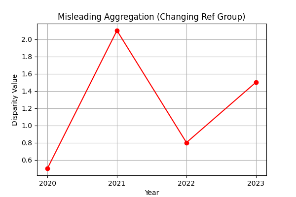
1. Misleading Aggregation & Continuity in Disparity Ratios
The Problem: The "Disparity Value" in this dataset is a ratio calculated by dividing the prevalence of the Focus Group by the prevalence of a constantly changing Reference Group.
Showing these ratios together and joining them sequentially is not meaningful. In many tools, points are joined blindly from one calculation to the next, creating erratic lines that imply a trend where none exists because the denominator (the reference group) is not constant.
Critical Rule: Taking the aggregate (sum, mean, etc.) of these values without understanding the column data is not a good idea. Since each ratio measures a completely different comparison, their average is statistically meaningless.
Data Snippet (California, 2023 - Notice the changing Reference Group):
| Year | Focus Group | Focus % (A) | Reference Group | Ref % (B) | Disparity Value (A/B) |
|---|---|---|---|---|---|
| 2023 | Non-Hispanic Asian | 5.7 | Non-Hispanic Black | 11.9 | 0.5 |
| 2023 | Non-Hispanic Asian | 5.7 | Non-Hispanic White | 9.2 | 0.6 |
| 2023 | Non-Hispanic Black | 11.9 | Hispanic | 8 | 1.5 |
| 2023 | Non-Hispanic Black | 11.9 | Non-Hispanic AIAN | No Data | N/A |
| 2023 | Non-Hispanic Black | 11.9 | Non-Hispanic Asian | 5.7 | 2.1 |
| 2023 | Non-Hispanic Black | 11.9 | Non-Hispanic White | 9.2 | 1.3 |
| 2023 | Non-Hispanic White | 9.2 | Hispanic | 8 | 1.2 |
| 2023 | Non-Hispanic White | 9.2 | Non-Hispanic AIAN | No Data | N/A |
| 2023 | Non-Hispanic White | 9.2 | Non-Hispanic Asian | 5.7 | 1.6 |
| 2023 | Non-Hispanic White | 9.2 | Non-Hispanic Black | 11.9 | 0.8 |
Notice how the "Reference Group (B)" changes for every row. Averaging these values would combine comparisons against Blacks, Whites, Hispanics, etc., into a single meaningless number.
Code Comparison:
❌ Bad Code (Blind Aggregation):
# Blindly plotting all data points connected
subset_sorted = subset.sort_values(by=['Year'])
plt.plot(subset_sorted['Year'], subset_sorted['Disparity Value'], label='Joined Values')

# Averaging disparate ratios
yearly_mean = subset.groupby('Year')['Disparity Value'].mean()
plt.plot(yearly_mean.index, yearly_mean.values, label='Aggregated Mean')
✅ Good Code (Consistent Reference Group):
# Filter for ONE consistent reference group
subset = df[df['Reference Group'] == 'Non-Hispanic White']

# Plot separate lines for each Focus Group
for group in subset['Focus Group'].unique():
    group_data = subset[subset['Focus Group'] == group]
    plt.plot(group_data['Year'], group_data['Disparity Value'], label=group)
Diagram Comparison:
| Bad Visualization | Good Visualization |
|---|---|
 |
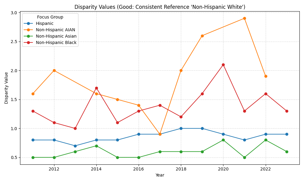 |
The "Good" chart clearly separates trends for different groups against a single benchmark (White), whereas the "Bad" chart creates a meaningless "average" line.
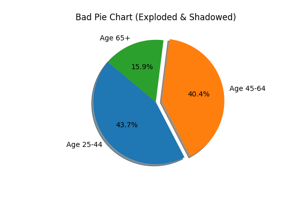
2. The Misleading 3D Pie Chart
The Problem: Pie charts are already difficult for the human eye to compare areas accurately. Adding a 3D effect distorts the proportions further, making slices in the foreground appear larger than they are. Additionally, "exploding" slices arbitrarily can distract from the actual data.
Data Snippet (Age-Related Disparities in Alabama, 2011):
| State | Year | Demographic | Comparison Group | Prevalence % |
|---|---|---|---|---|
| Alabama | 2011 | Age | Age 25-44 | 28.1 |
| Alabama | 2011 | Age | Age 45-64 | 26.0 |
| Alabama | 2011 | Age | Age 65 or older | 10.2 |
Code Comparison:
❌ Bad Code (3D Pie):
# 3D, Exploded, Shadowed Pie Chart
plt.pie(sizes, labels=labels, explode=[0, 0.1, 0], shadow=True)
plt.title("Age Group Smoking")
✅ Good Code (Simple Bar):
# Simple 2D Bar Chart
plt.bar(labels, values)
plt.xlabel("Age Group")
plt.ylabel("Prevalence %")
Diagram Comparison:
| Bad Visualization | Good Visualization |
|---|---|
 |
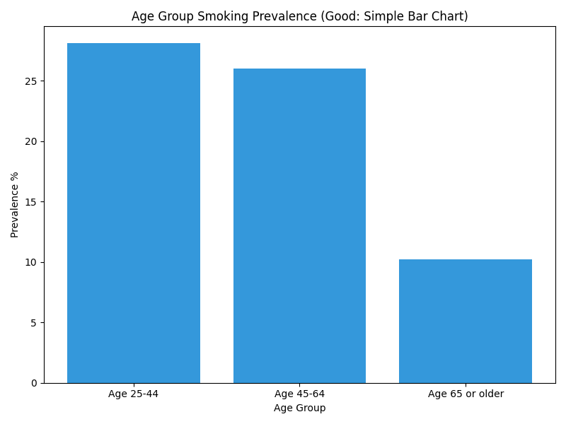 |
The bar chart makes it instantly obvious that "Age 25-44" is slightly higher than "Age 45-64", a comparison that is ambiguous in the 3D pie chart.
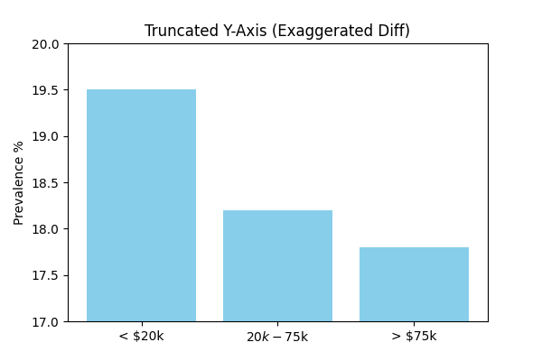
3. The Truncated Y-Axis Bar Chart
The Problem: Starting the y-axis at a non-zero value is a classic way to exaggerate differences between groups. It can make a small, insignificant difference look massive.
Data Snippet (Income-Related Disparities in California, 2012):
| State | Year | Comparison Group | Prevalence % |
|---|---|---|---|
| California | 2012 | Less than $20,000 | 19.5 |
| California | 2012 | From 74,999 | 14.2 |
| California | 2012 | $75,000 or above | 8.5 |
Code Comparison:
❌ Bad Code (Truncated Axis):
plt.bar(categories, values)
# Manually setting limits close to data range
plt.ylim(min(values) - 1, max(values) + 1)
✅ Good Code (Full Axis):
plt.bar(categories, values)
# Ensure axis starts at 0 (matplotlib default for bars usually, but explicit here)
plt.ylim(0, max(values) * 1.2)
Diagram Comparison:
| Bad Visualization | Good Visualization |
|---|---|
 |
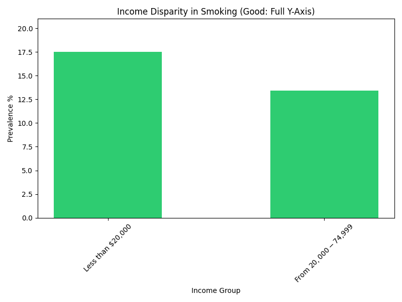 |
The "Bad" chart makes the difference look dramatic. The "Good" chart shows a significant difference, but accurately portrays the relative scale (e.g., the lowest group is about half of the highest, not 1/10th).
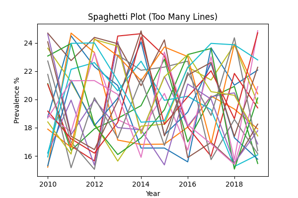
4. The "Spaghetti" Plot
The Problem: Plotting too many lines on a single chart without clear separation or highlighting results in a messy, unreadable graph often called a "spaghetti plot". It's impossible to follow individual trends.
Data Snippet (Race/Ethnic Disparities across Multiple States):
| State | Year | Comparison Group | Prevalence % |
|---|---|---|---|
| Alaska | 2011 | White | 24.5 |
| Arizona | 2011 | White | 18.2 |
| Arkansas | 2011 | White | 25.1 |
| ... | ... | ... | ... |
Code Comparison:
❌ Bad Code (All Lines Same):
for state in states:
    # Plotting every state with default colors/styles
    plt.plot(years, values, label=state)
plt.legend() # Legend becomes huge and unreadable
✅ Good Code (Highlighting):
highlight = 'Alaska'
for state in states:
    if state == highlight:
        # Thick Red Line for focus
        plt.plot(years, values, color='red', linewidth=3, label=state)
    else:
        # Thin Gray Line for context
        plt.plot(years, values, color='gray', alpha=0.3)
Diagram Comparison:
| Bad Visualization | Good Visualization |
|---|---|
 |
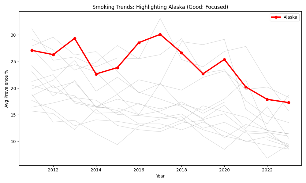 |
The "Good" visualization uses the "gray-out" technique to focus the reader's attention on a specific story (Alaska) while still providing the context of other states.
5. The Weakest Visualization: Cluttered Correlation Heatmap
The Problem: One-hot encoding categorical variables like state doesn't create linear relationships. Forcing these values into a correlation heatmap results in a massive, noisy grid that offers zero actionable insight. Just because you can generate numerical values through encoding doesn't mean you should simply "slap on a heatmap"—always pause to ask if the visualization is actually meaningful.
Critical Evaluation: The relationships between your original categorical variables and the disparity_value are much more clearly and appropriately communicated through bar charts and box plots, provided you first filter for a consistent reference group (e.g., "vs. White") to ensure the mean is meaningful.
Code Comparison:
❌ Bad Code (One-Hot Encoded Heatmap):
# Encoding 50+ states creates a massive, sparse matrix
df_encoded = pd.get_dummies(df, columns=['State'])
sns.heatmap(df_encoded.corr())
✅ Good Code (Filtered Aggregation):
# 1. Filter for a consistent reference group (Critical!)
subset = df[df['Reference Group'] == 'Non-Hispanic White']

# 2. Group by category and show distribution/mean
state_summary = subset.groupby('State')['Disparity Value'].mean()
state_summary.sort_values().plot(kind='bar')
Diagram Comparison:
| Bad Visualization | Good Visualization |
|---|---|
 |
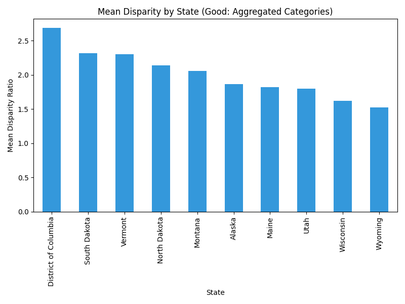 |
The "Bad" heatmap is a wall of noise. The "Good" bar chart (or a similar box plot) immediately identifies which states have the highest and lowest disparity values.
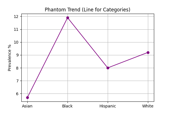
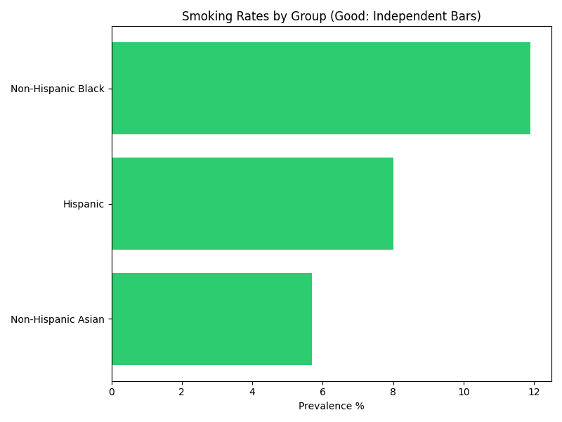
6. Connecting Categorical Data (The "Phantom Trend")
The Problem: Using a line chart to display categorical data (like Race or State) implies a continuity or trend that doesn't exist. It suggests that there is a logical progression from one category to the next (e.g., that "Asian" transitions into "Black"), which is nonsensical.
Data Snippet (California, 2023):
| Race/Ethnicity | Prevalence % |
|---|---|
| Non-Hispanic Asian | 5.7 |
| Non-Hispanic Black | 11.9 |
| Hispanic | 8.0 |
| Non-Hispanic White | 9.2 |
Code Comparison:
❌ Bad Code (Line for Categories):
# Connecting distinct racial groups with a line
plt.plot(df['Race'], df['Prevalence'], marker='o')
✅ Good Code (Bar for Categories):
# Using bars to show distinct, independent values
plt.bar(df['Race'], df['Prevalence'])
Diagram Comparison:
| Bad Visualization | Good Visualization |
|---|---|
 |
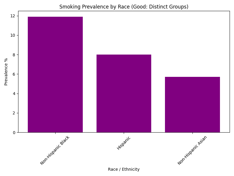 |
The line chart creates a visual connection that implies order. The bar chart correctly treats each racial group as an independent entity.
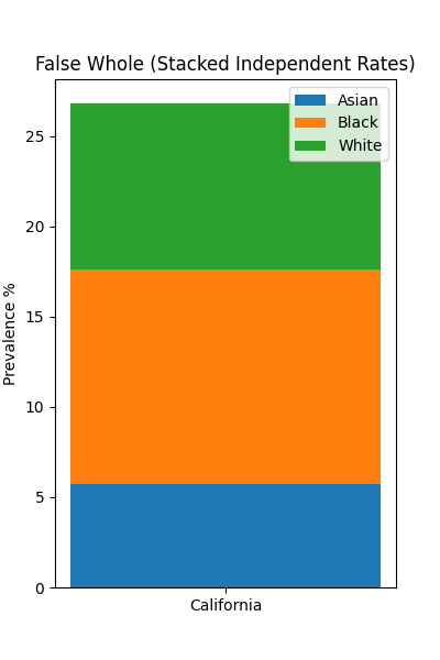
7. Stacking Rates (The "False Whole")
The Problem: Stacked bar charts are designed to show how parts contribute to a whole (e.g., votes in an election, budget allocation). Smoking prevalence rates are independent statistics for different populations; they do not sum up to 100% or any meaningful total. Stacking them creates a "total height" that has no physical meaning.
Data Snippet (California, 2023):
| Group | Prevalence % |
|---|---|
| Asian | 5.7 |
| Black | 11.9 |
| White | 9.2 |
| Sum | 26.8 (Meaningless) |
Code Comparison:
❌ Bad Code (Stacked Bars):
# Stacking rates on top of each other
bottom = 0
for group in groups:
    plt.bar("California", val, bottom=bottom)
    bottom += val
✅ Good Code (Grouped/Horizontal Bars):
# Plotting independent bars for comparison
plt.barh(groups, values)
Diagram Comparison:
| Bad Visualization | Good Visualization |
|---|---|
 |
 |
The stacked bar implies that these groups combine to form a larger smoking population metric, which is false. The horizontal bar chart allows for easy, direct comparison of the rates without implying accumulation.
Data Source
The examples in this chapter utilize open data from the CDC: