Visualizations
'A picture is worth a thousand words' is not just a hearsay idiom; it is a fact. Nothing speaks louder and clearer than pictures when it comes to data analytics. A complex relationship between multiple variants can be conveyed with just a single plot. A correlation graph conveys the meaning or essence of a relationship more effectively than a lengthy description does. In this lesson, you will explore how to create meaningful visualizations using the Matplotlib and Seaborn libraries.
Simple Visualizations With Matplotlib
Although we tend to use Seaborn for sophisticated visualizations, you can use Matplotlib for simple diagrams or when you need more flexibility with your diagrams. Matplotlib is a low-level visualization library for Python that provides more fine-grained access to functions to help customize your diagrams.
Here are a few examples of simple plots using Matplotlib:
Line charts
A basic line plot just needs the 'x' and/or 'y' numerical values for plotting. If only 'y' is given, the index values of 'y' are plotted on the 'x'-axis. Here is an example where we explicitly define both to show a simple mathematical relationship:
import matplotlib.pyplot as plt
import numpy as np

# Data
x = np.arange(1, 10)
y = x * 2

plt.figure(figsize=(10, 6))
plt.plot(x, y, marker='o', color='#3498db', linewidth=2, linestyle='-')
plt.title('Linear Growth: y = 2x')
plt.xlabel('Input Value (x)')
plt.ylabel('Doubled Value (2x)')
plt.grid(True, linestyle='--', alpha=0.7)
plt.show()
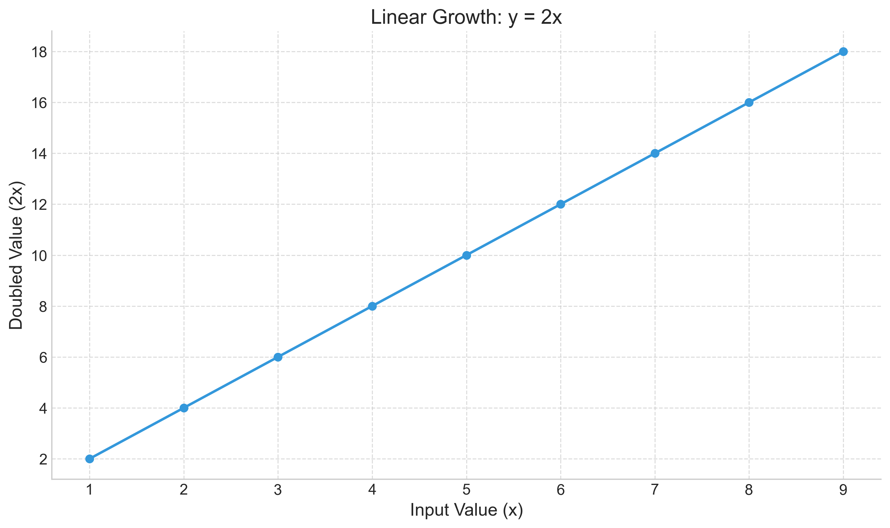 In the code above, we first import the `pyplot` module. We set a custom color and marker to make the data points distinct. The title and axis labels clearly explain the relationship shown.
To change the line style further, check the examples in the 'Styling in Matplotlib' section below.
Histogram
Suppose you want to see the frequency distribution of the continuous values of age in the sample data of Titanic travelers. You could plot a histogram and add a text annotation to highlight the most significant age group:
import matplotlib.pyplot as plt
import seaborn as sns

# Load dataset
titanic = sns.load_dataset('titanic')

plt.figure(figsize=(10, 6))
# Capture return values to customize if needed
n, bins, patches = plt.hist(titanic.age.dropna(), bins=20, color='#2ecc71', edgecolor='white', alpha=0.8)

plt.title('Age Distribution of Travelers')
plt.xlabel("Age")
plt.ylabel("Number of Travelers")

# Storytelling: Highlight the peak
plt.text(20, 45, 'Peak: Young Adults\n(20-30 years)',
         fontsize=12, bbox=dict(facecolor='white', alpha=0.9, edgecolor='gray', boxstyle='round,pad=0.5'))
plt.show()
Output:
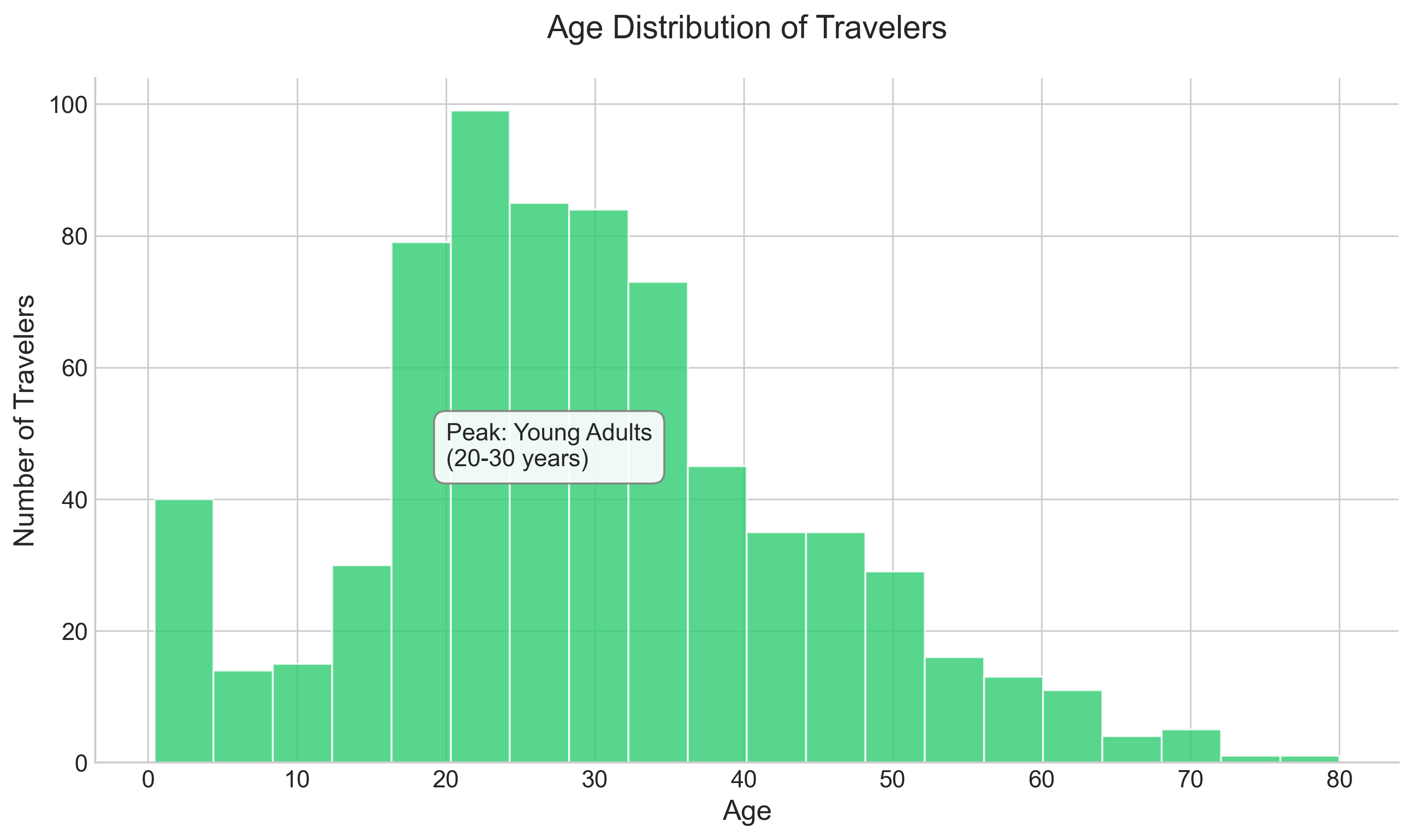
Note that we dropped all the NaN values of age by invoking the dropna() function on the age column. By adding a text box, we immediately guide the viewer to the most important part of the distribution.
The bin size is automatically calculated by the library; however, we can specify the bin size if required. Refer to the official documentation for details: https://matplotlib.org/api/_as_gen/matplotlib.pyplot.hist.html
Bar chart
Suppose you want to see the total number of people who embarked from different towns. You can use different colors for each bar and label the maximum value directly on the chart:
# Explicitly calculating counts
count_by_embark = titanic.groupby('embark_town').size()

# Distinct colors
colors = ['#34495e', '#e74c3c', '#3498db']

plt.figure(figsize=(10, 6))
bars = plt.bar(count_by_embark.index, count_by_embark.values, color=colors)

plt.title('Passenger Count by Embarkation Town')
plt.ylabel("Total Travelers")
plt.xlabel("Embarkation Town")

# Annotate the max
max_val = count_by_embark.max()
max_town = count_by_embark.idxmax()

# Find the bar corresponding to max_town
for rect, label in zip(bars, count_by_embark.index):
    if label == max_town:
            height = rect.get_height()
            plt.text(rect.get_x() + rect.get_width()/2.0, height + 5, f"{int(height)}", ha='center', va='bottom', fontweight='bold', fontsize=12)

plt.show()
Output:
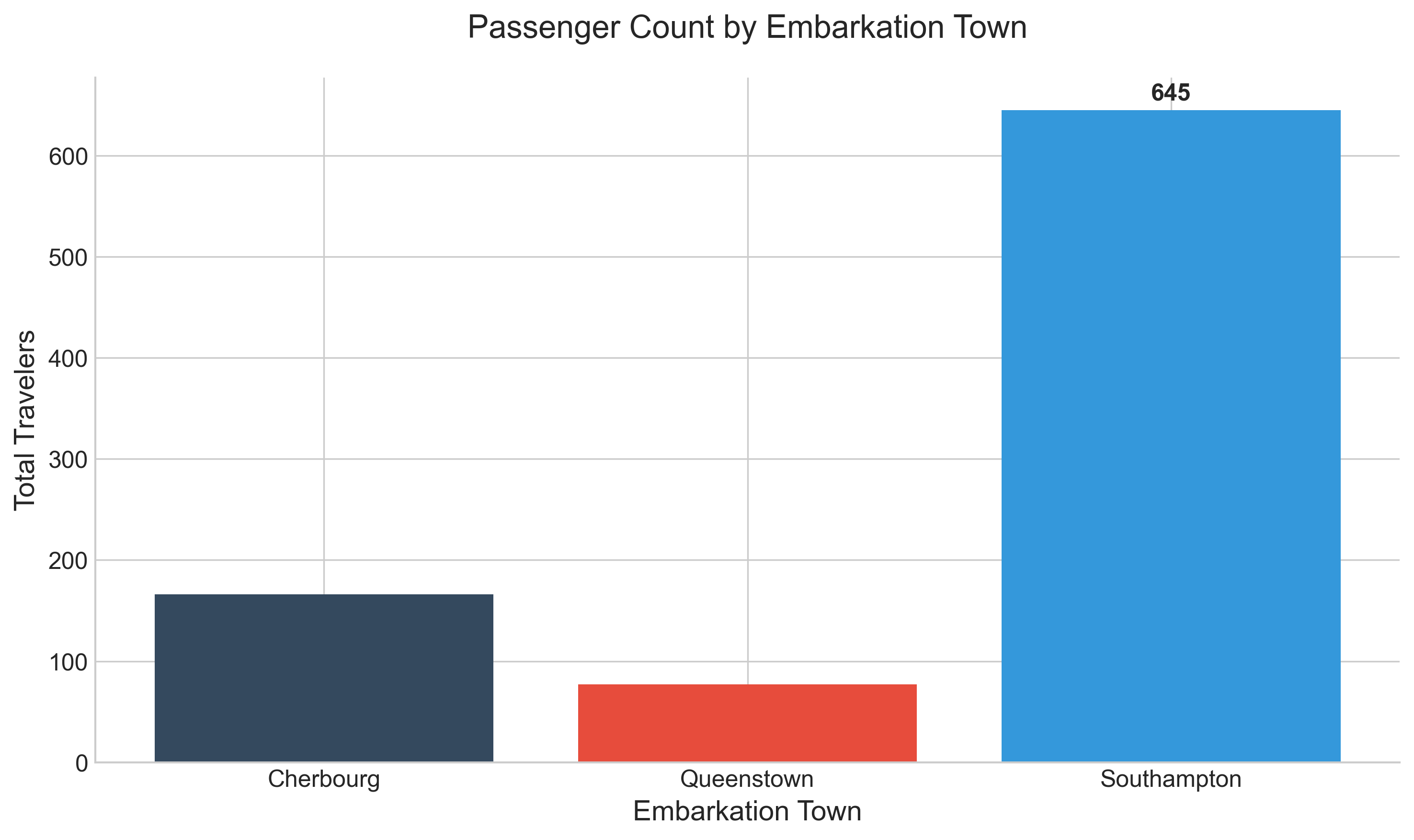
This visual quickly shows that Southampton was by far the busiest embarkation point.
The code for the bar chart is very similar to the histogram. Note that first, you use the groupby function to help group the distinct values of embark_town, and then use the index values for the 'x'-axis and the grouped values for the 'y'-axis. Reference the documentation for details: https://matplotlib.org/api/_as_gen/matplotlib.pyplot.bar.html
Instead of using groupby, you can also use the value_counts() function on the embark_town column. Here is an alternative way of getting the same diagram:
plt.bar(titanic['embark_town'].dropna().unique(), titanic['embark_town'].value_counts())
plt.title('Embarked Towns')
plt.ylabel("total of travelers")
plt.show()
However, note that if you do not drop the na values for the 'x'-axis, it gives you an error as it tries to convert NaN to a string type and fails.
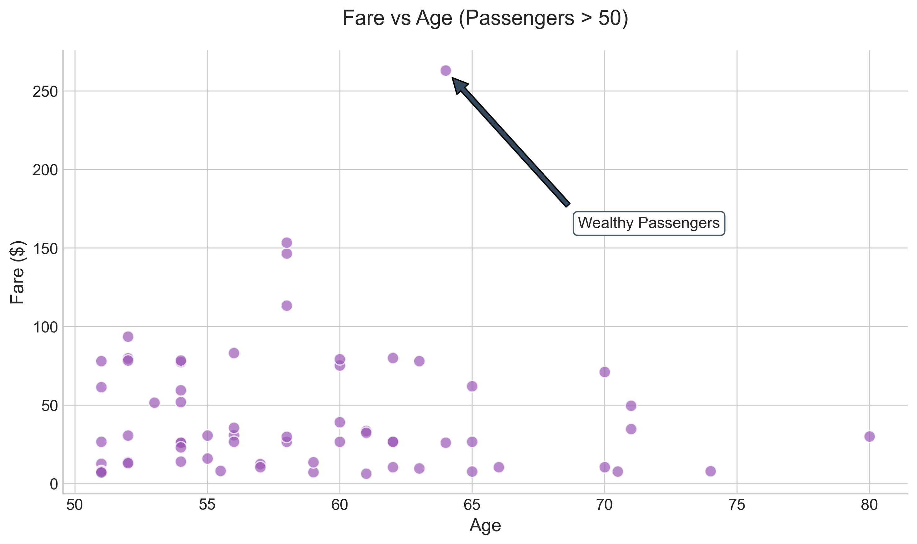
Scatter plot
Scatter plots are excellent for identifying outliers. For instance, you can plot the fare paid by passengers older than 50 and use an annotation to point out the highest spenders:
subset = titanic[titanic.age > 50]

plt.figure(figsize=(10, 6))
plt.scatter(subset.age, subset.fare, alpha=0.7, color='#9b59b6', edgecolors='white', s=80)
plt.title('Fare vs Age (Passengers > 50)')
plt.ylabel("Fare ($)")
plt.xlabel("Age")

# Highlight wealthy outlier
wealthy = subset[subset.fare > 200]
if not wealthy.empty:
    hf_pt = wealthy.iloc[0]
    plt.annotate('Wealthy Passengers', xy=(hf_pt.age, hf_pt.fare), xytext=(65, 400),
                    arrowprops=dict(facecolor='#34495e', shrink=0.05),
                    fontsize=12, bbox=dict(boxstyle="round,pad=0.3", fc="white", ec="#34495e", alpha=0.9))

plt.show()
Output:
Subplots in Matplotlib
Plots in Matplotlib are drawn within a 'Figure' object. To create multiple subplots (a grid of charts), we first get a handle on this Figure object using plt.figure().
Here is an example showing how to define a 2x2 layout:
fig = plt.figure(figsize=(10, 8))

for i in range(1, 5):
    # (rows, cols, index)
    ax = fig.add_subplot(2, 2, i)
    ax.text(0.5, 0.5, f'Subplot {i}', ha='center', va='center', fontsize=18, color='gray')
    ax.set_xticks([])
    ax.set_yticks([])

plt.suptitle("Matplotlib Subplots Layout", fontsize=20)
plt.show()
Output:
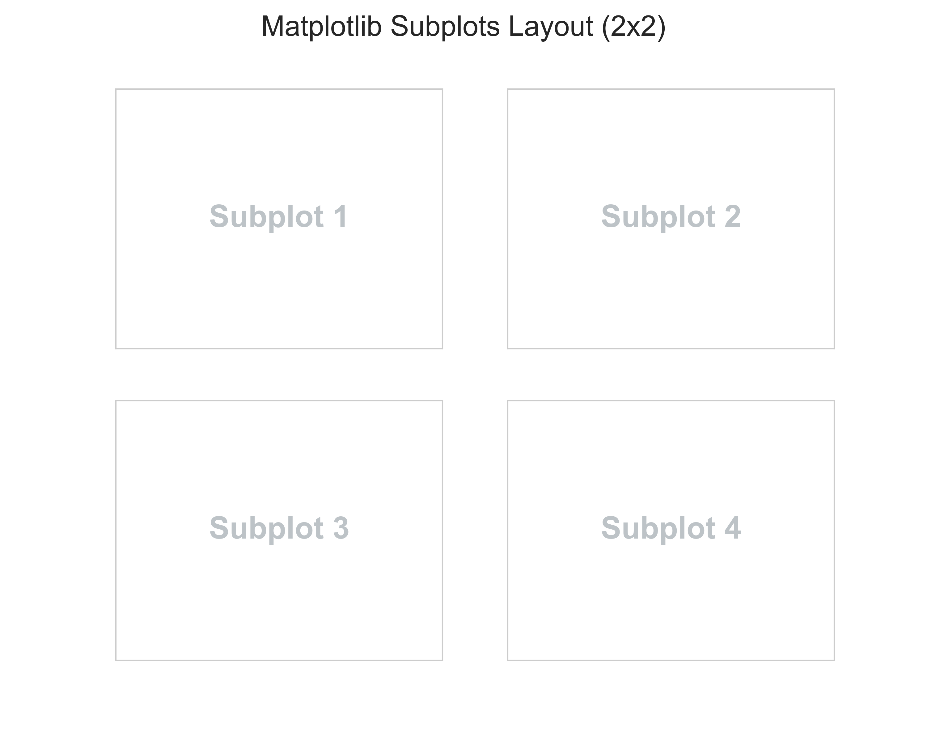
The arguments 2, 2, 1 for the first subplot tell the figure to create a layout of 2 rows and 2 columns and then assign the first position to this subplot.
Now, let's fill these with actual data to tell a complete story about the Titanic dataset:
fig = plt.figure(figsize=(12, 10))

# Subplot 1: Histogram of Age
ax1 = fig.add_subplot(2, 2, 1)
sns.histplot(titanic['age'].dropna(), bins=15, ax=ax1, color='skyblue', kde=True)
ax1.set_title("Age Distribution")

# Subplot 2: Bar Chart of Embarkation
ax2 = fig.add_subplot(2, 2, 2)
counts = titanic['embark_town'].value_counts()
sns.barplot(x=counts.index, y=counts.values, ax=ax2, palette="pastel")
ax2.set_title("Embarkation Points")

# Subplot 3: Box Plot of Age
ax3 = fig.add_subplot(2, 2, 3)
sns.boxplot(x=titanic['age'].dropna(), ax=ax3, color='lightgreen')
ax3.set_title("Age Box Plot")

# Adjust layout to prevent overlap
plt.tight_layout()
plt.show()
Output:
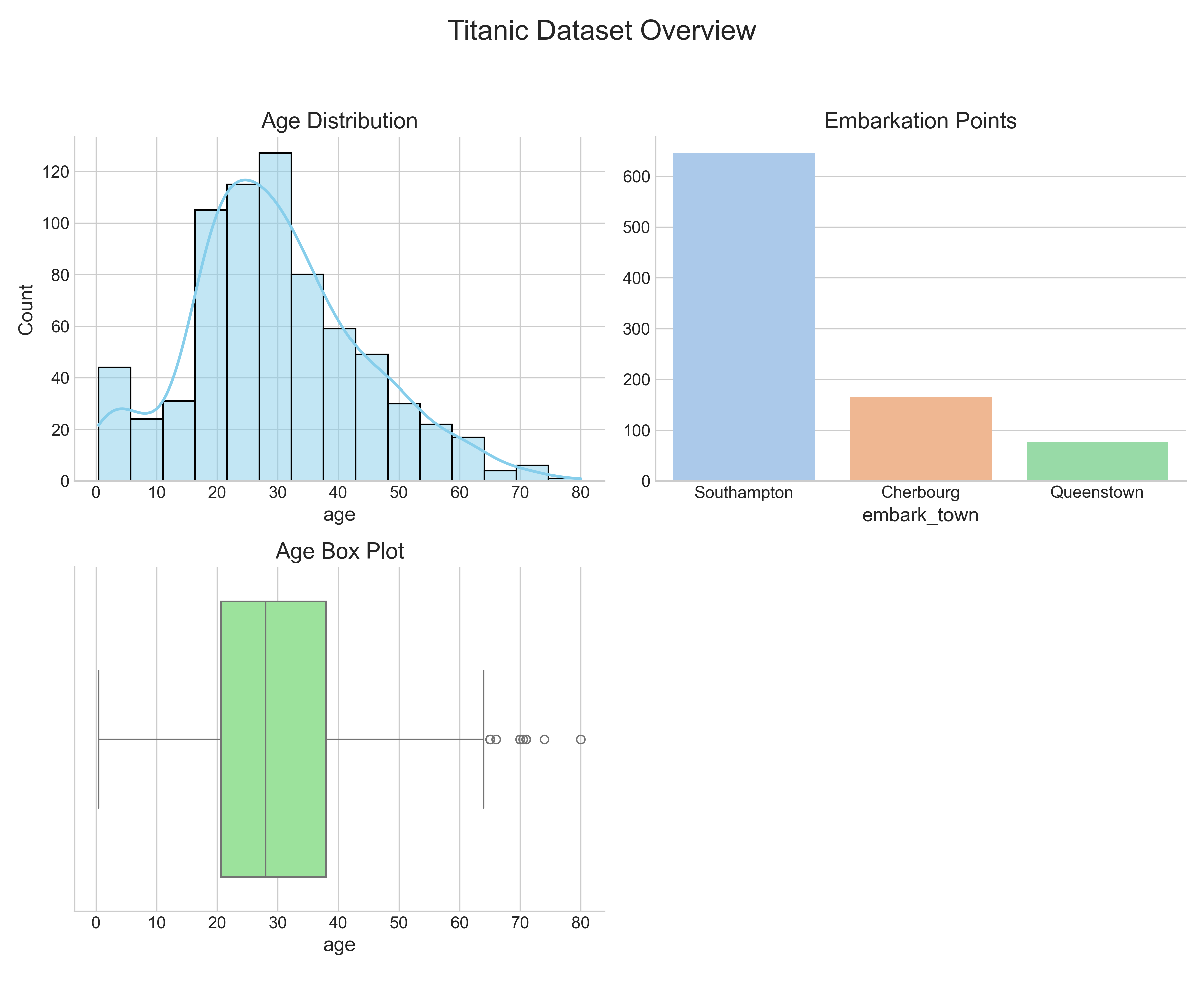
Using tight_layout() ensures that titles and labels don't overlap. This grid gives a comprehensive overview of the passengers' demographics in a single glance.
Styling in Matplotlib
You can specify the color, markers, and line style for your subplots by passing the respective attributes. Here are a few examples:
Given x and y values, to get a dashed green line plot, you could use one of the methods below:
subplot.plot(x, y, 'g--')
subplot.plot(x, y, linestyle='--', color='g')
Here is another example to change the marker to 'x' and the line color to blue with a regular line:
import pandas as pd
import numpy as np
plt.plot(np.random.randn(30).cumsum(), 'bx-')
plt.show()
The plot above can also be drawn by setting the individual attributes for marker, linestyle, color, etc., as shown below:
plt.plot(pd.np.random.randn(30).cumsum(), color='b', linestyle='solid', marker='x')
plt.show()
The randn(30) function returns 30 sample random numbers from a standard normal distribution, which contains both positive and negative floating-point numbers. The cumsum() function derives the cumulative sum of these random numbers. You can also drop cumsum() and just plot the random numbers, in which case the y-axis will have the random value and the x-axis will have the index position of the number.
To apply grid lines for both the 'x' and 'y' axes, you can use the function:
plt.grid()
To change the font of the labels, you can set the fontsize keyword argument when invoking the xlabel() and ylabel() functions.
Simple Visualizations With Pandas
Pandas DataFrame and Series objects come with a built-in .plot() method that makes creating charts very convenient, using Matplotlib under the hood.
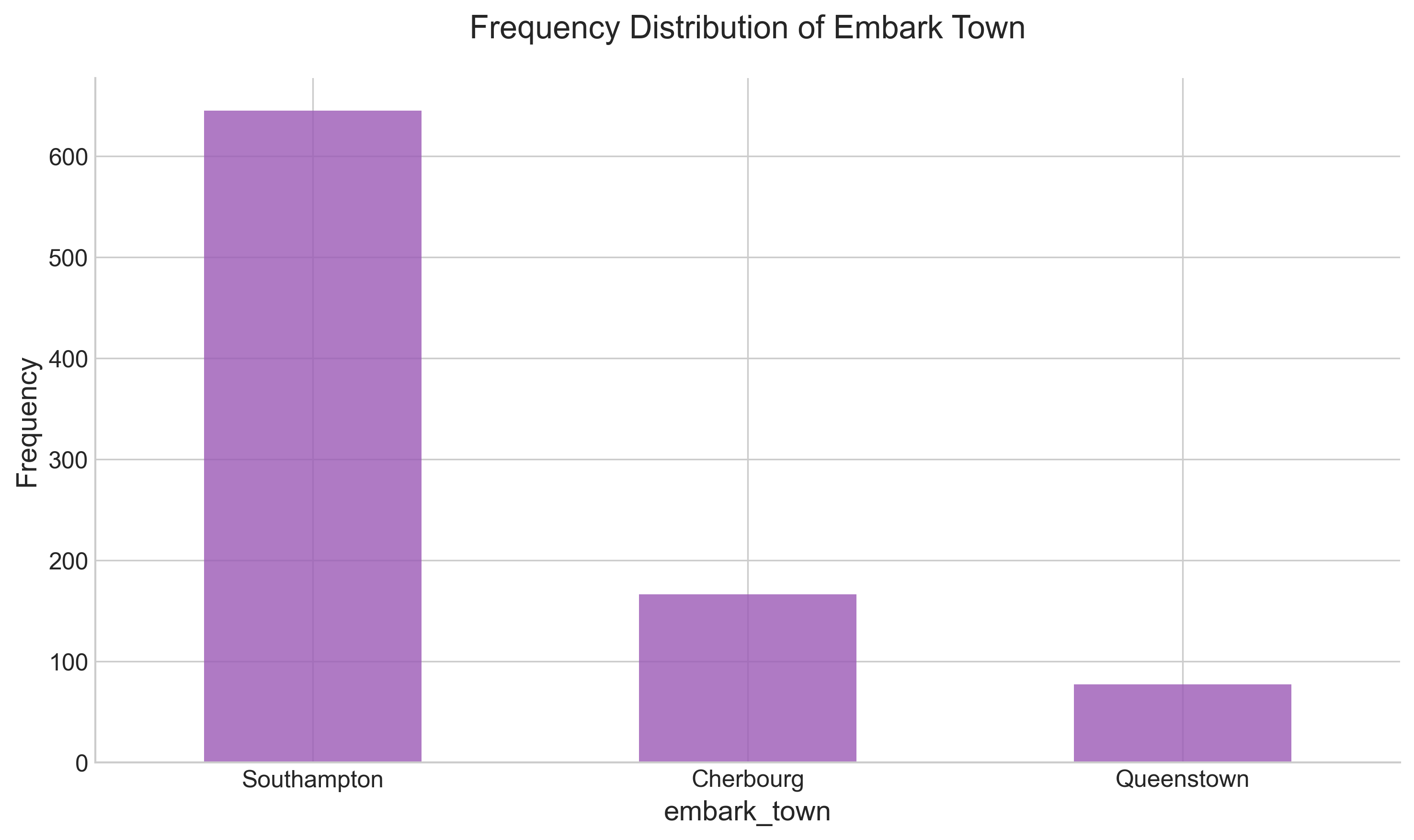
Using value_counts() on a Series object
You can directly apply the value_counts() function to a Series containing categorical data to get an aggregation of
individual categories. Then, simply call .plot():
# 'rot=0' keeps the x-axis labels horizontal
titanic['embark_town'].value_counts().plot(
    kind='bar',
    color='#9b59b6',
    title='Frequency Distribution of Embark Town',
    rot=0
)
plt.ylabel('Frequency')
plt.show()
Using groupby result
You can also plot the result of a groupby operation. For example, let's see the survival rate across different age groups (created via binning):
# Create meaningful age groups
survived_by_age_group = titanic.groupby(
   pd.cut(titanic['age'], bins=[0, 18, 35, 60, 80], labels=['Child', 'Young Adult', 'Adult', 'Senior'])
)['survived'].mean()

# Plot
ax = survived_by_age_group.plot(kind='bar', color='#34495e', rot=0, width=0.7)
plt.title('Survival Rate by Age Group')
plt.ylabel('Survival Rate')
plt.ylim(0, 1) # Set y-axis limit to 100%
plt.grid(axis='y', linestyle='--', alpha=0.5)

# Add value labels
for p in ax.patches:
   ax.annotate(f"{p.get_height():.2f}", (p.get_x() + p.get_width() / 2., p.get_height()),
               ha='center', va='bottom', xytext=(0, 5), textcoords='offset points', fontweight='bold')

plt.show()
Output:
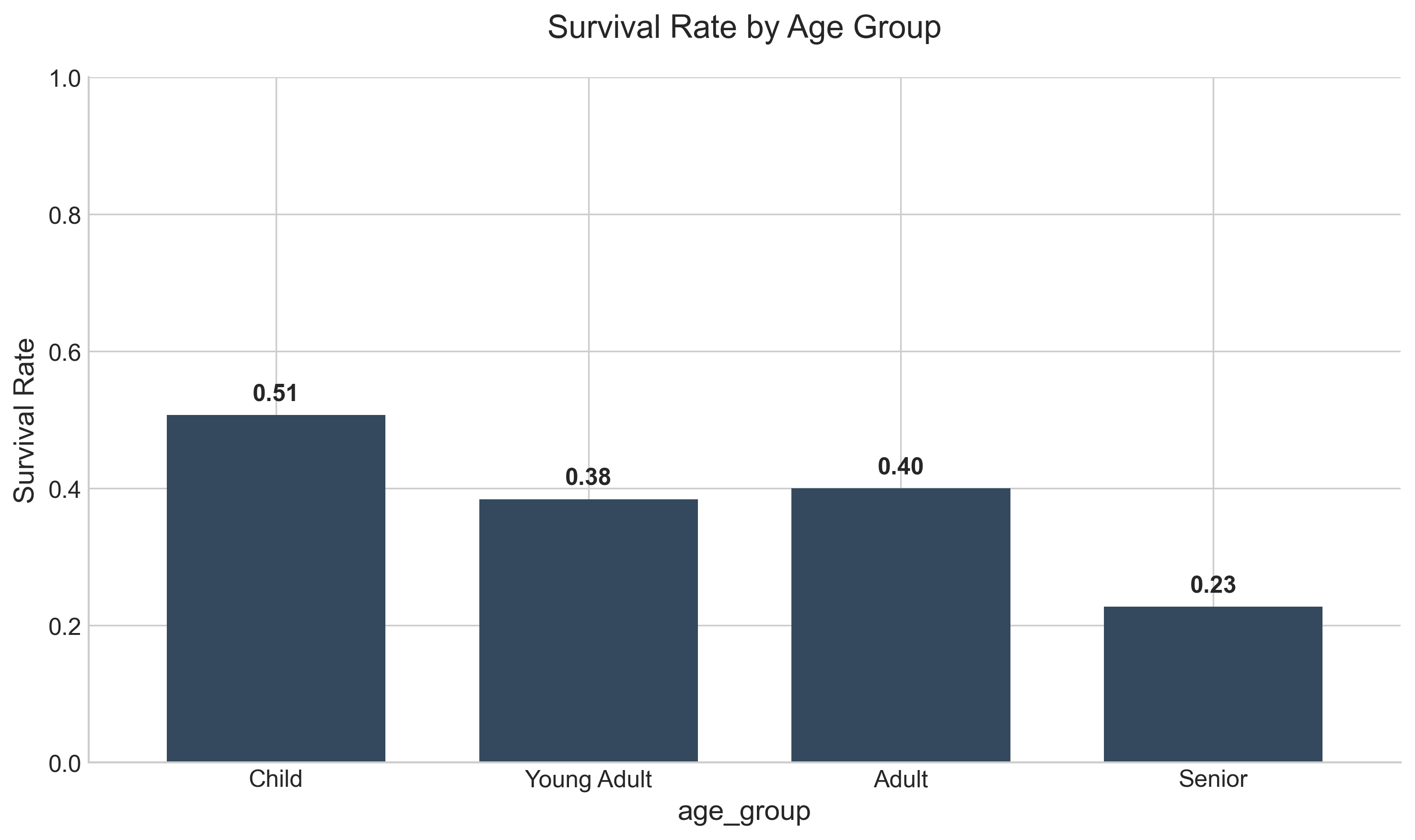
This clearly shows that children had a higher survival probability than seniors. Note that we can pass Matplotlib styling arguments like color and rot directly to the Pandas function.
Bar chart with Pareto diagram
A Pareto chart combines bars for frequency and a line for cumulative percentage, helping you identify the "vital few" categories:
s1 = titanic.embark_town.value_counts(normalize = True) * 100
fig, ax = plt.subplots(figsize=(10, 6))

# Bar plot for relative frequency
s1.plot(kind='bar', ax=ax, color='#f1c40f', edgecolor='white', alpha=0.8, rot=0)
ax.set_ylabel('Absolute Frequency (%)')
ax.grid(False)

# Line plot for cumulative percentage
s2 = s1.cumsum()
ax2 = ax.twinx()
ax2.plot(s2.index, s2.values, color='#c0392b', marker='D', linewidth=2, markersize=8)
ax2.set_ylabel('Cumulative Relative Frequency (%)')
ax2.set_ylim(0, 115)
ax2.grid(False)

# Annotate values on the line
for index, value in enumerate(s2):
    ax2.text(index, value + 3, f"{value:.0f}%", color='#c0392b', ha='center', fontweight='bold',
             bbox=dict(facecolor='white', edgecolor='none', alpha=0.7))

plt.title('Pareto Analysis of Embarkation', pad=20)
plt.show()
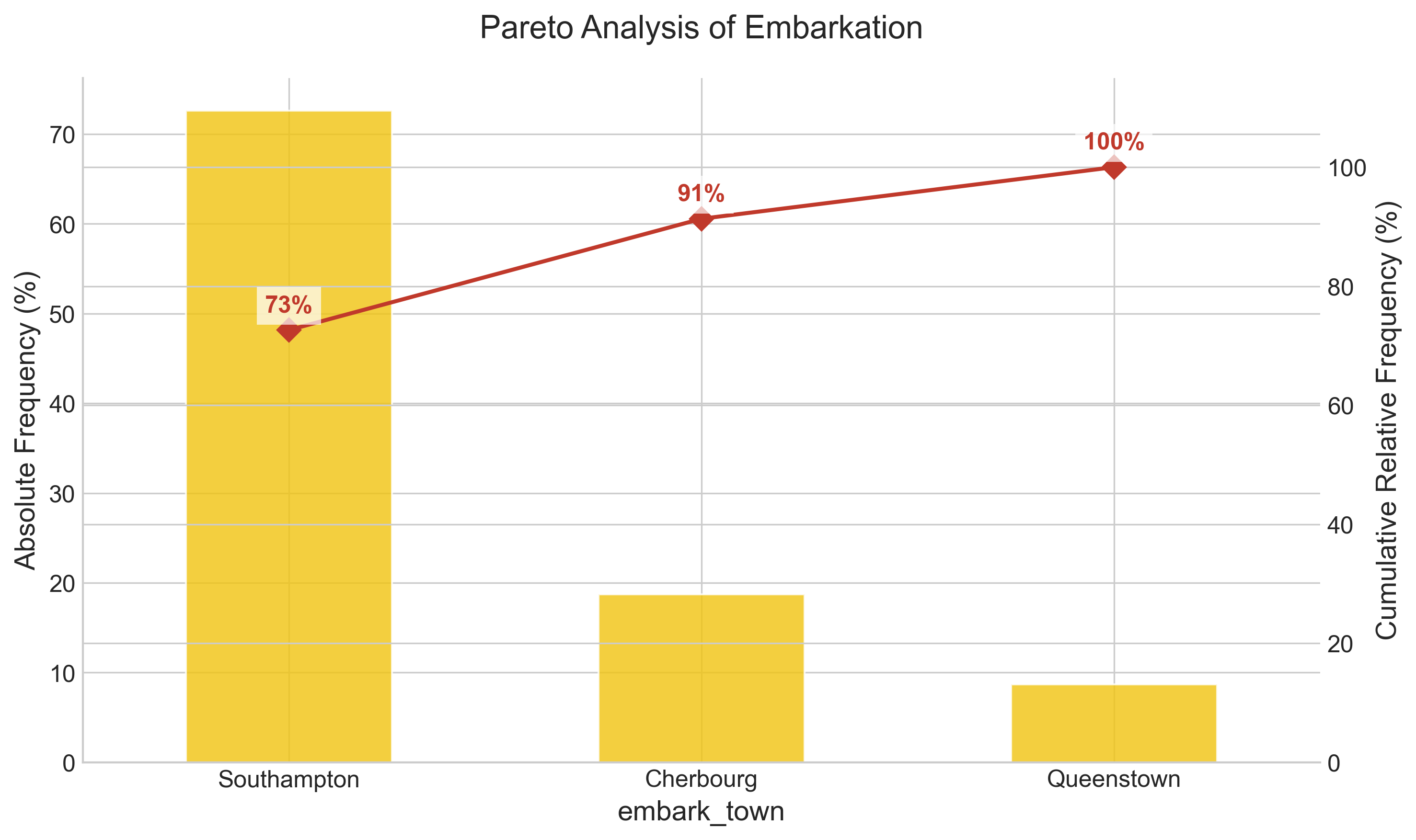
In the example above, you see that we have created a dual-axis chart. The cumsum() function computes the cumulative sum of the frequency values, which is the hallmark of a Pareto chart.
Note: A Pareto chart (named after Vilfredo Pareto) highlights the 80-20 rule, which asserts that 80% of outcomes often result from 20% of the causes. In our dataset, we can quickly see that Southampton accounts for over 70% of the travelers.
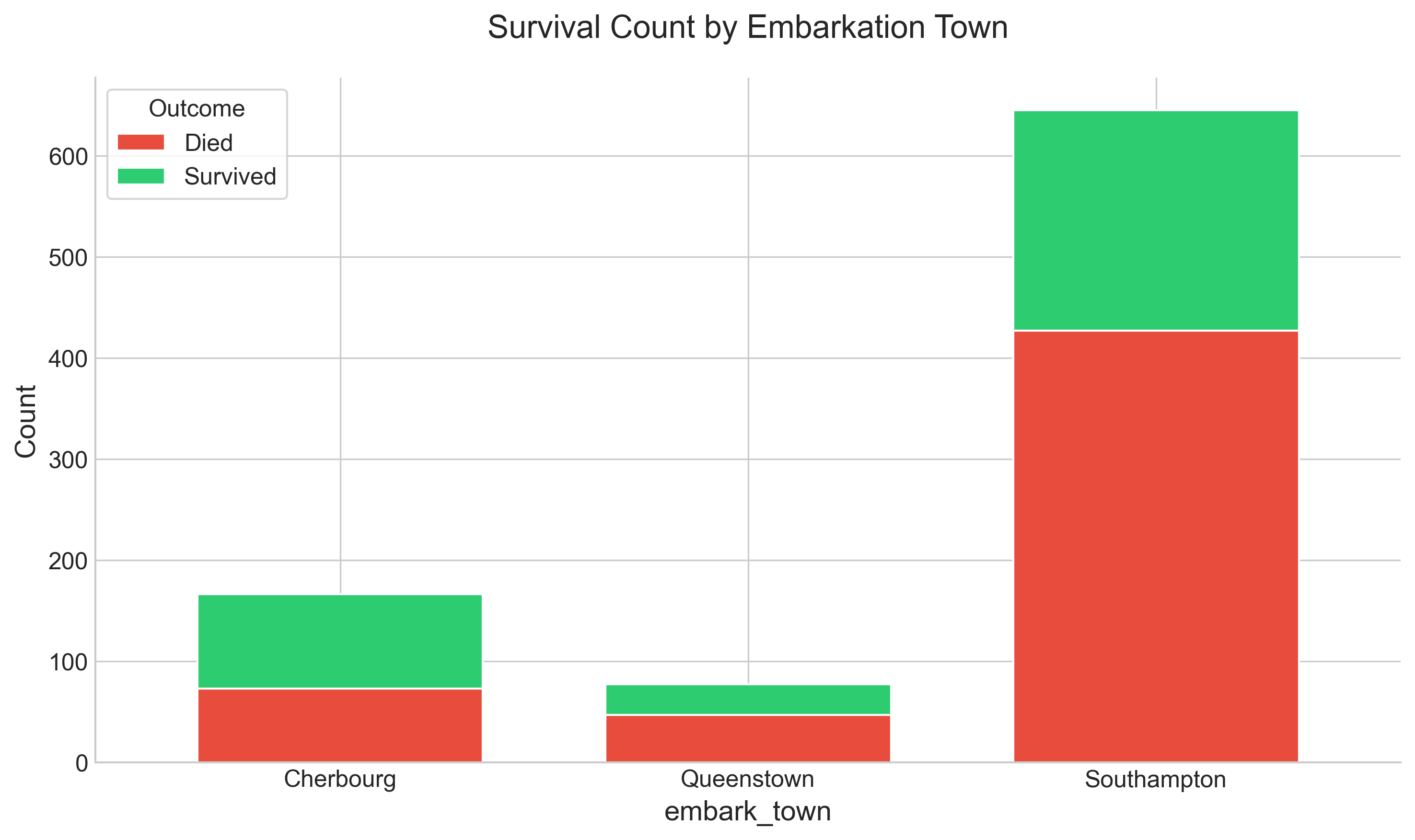
Stacked bar
To show the total number of survivors vs. non-survivors across each of the embark towns, you can do a groupby on both the embark_town and survived columns.
# Unstack creates a DataFrame where 'survived' values become columns
unstacked = titanic.groupby(['embark_town', 'survived']).size().unstack()
unstacked.columns = ['Died', 'Survived']

# Plot
unstacked.plot(kind='bar', stacked=True, color=['#e74c3c', '#2ecc71'], rot=0, edgecolor='white')
plt.title('Survival Count by Embarkation Town')
plt.ylabel('Count')
plt.show()
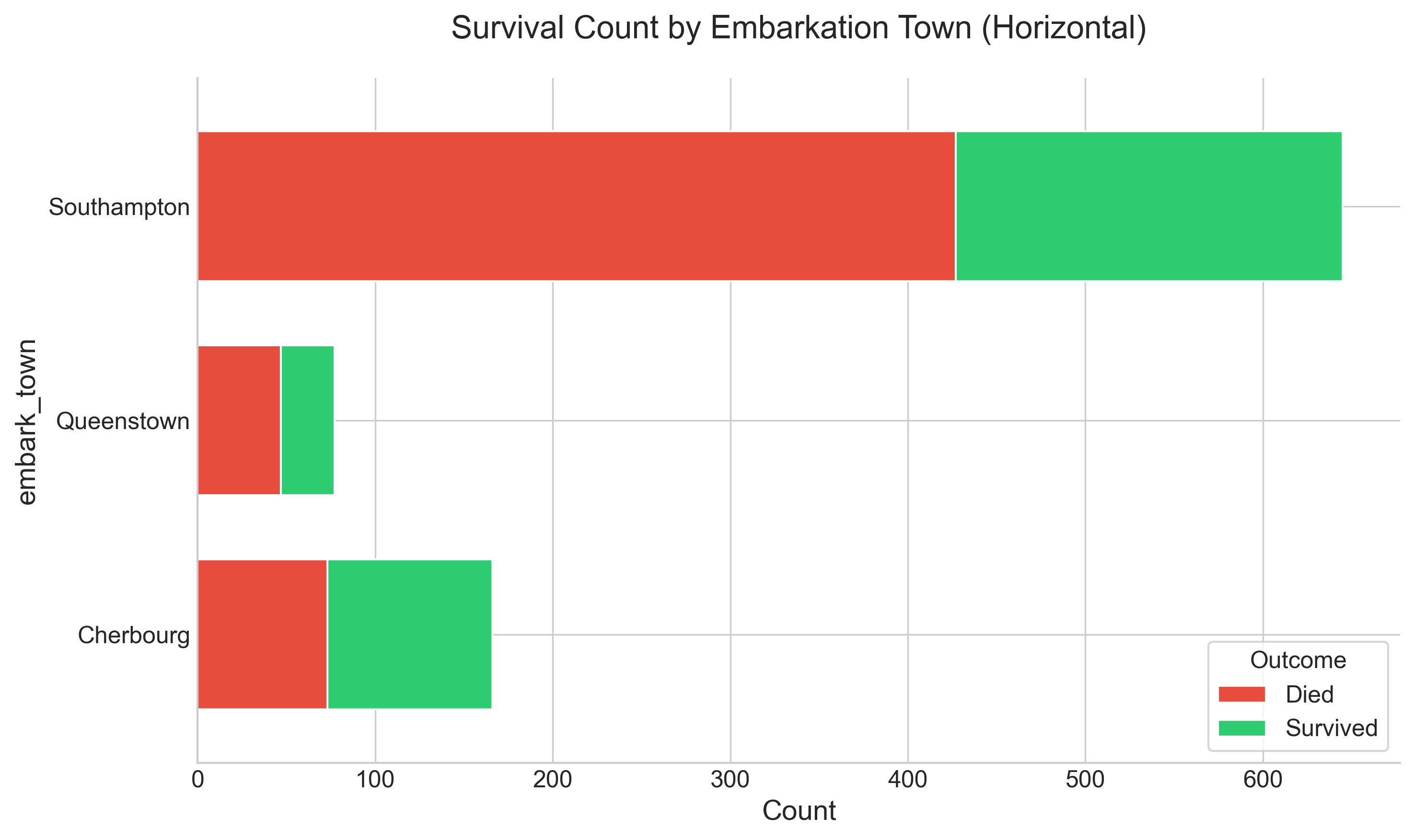
To show the same graph horizontally, you would change the kind to barh. This is often better for long labels.
unstacked.plot(kind='barh', stacked=True, color=['#e74c3c', '#2ecc71'])
plt.title('Survival Count by Embarkation Town (Horizontal)')
plt.xlabel('Count')
plt.show()
Apply plot function on a numerical column
You can directly apply the plot function to any of the numerical columns to get a distribution. Here is an example with pclass:
# Bins are set to center the bars on the integer values
titanic["pclass"].plot(
    kind='hist',
    bins=[0.5, 1.5, 2.5, 3.5],
    rwidth=0.8,
    color='#8e44ad',
    edgecolor='white'
)
plt.title('Distribution of Passenger Class')
plt.xlabel('Class')
plt.xticks([1, 2, 3])
plt.show()
Output:
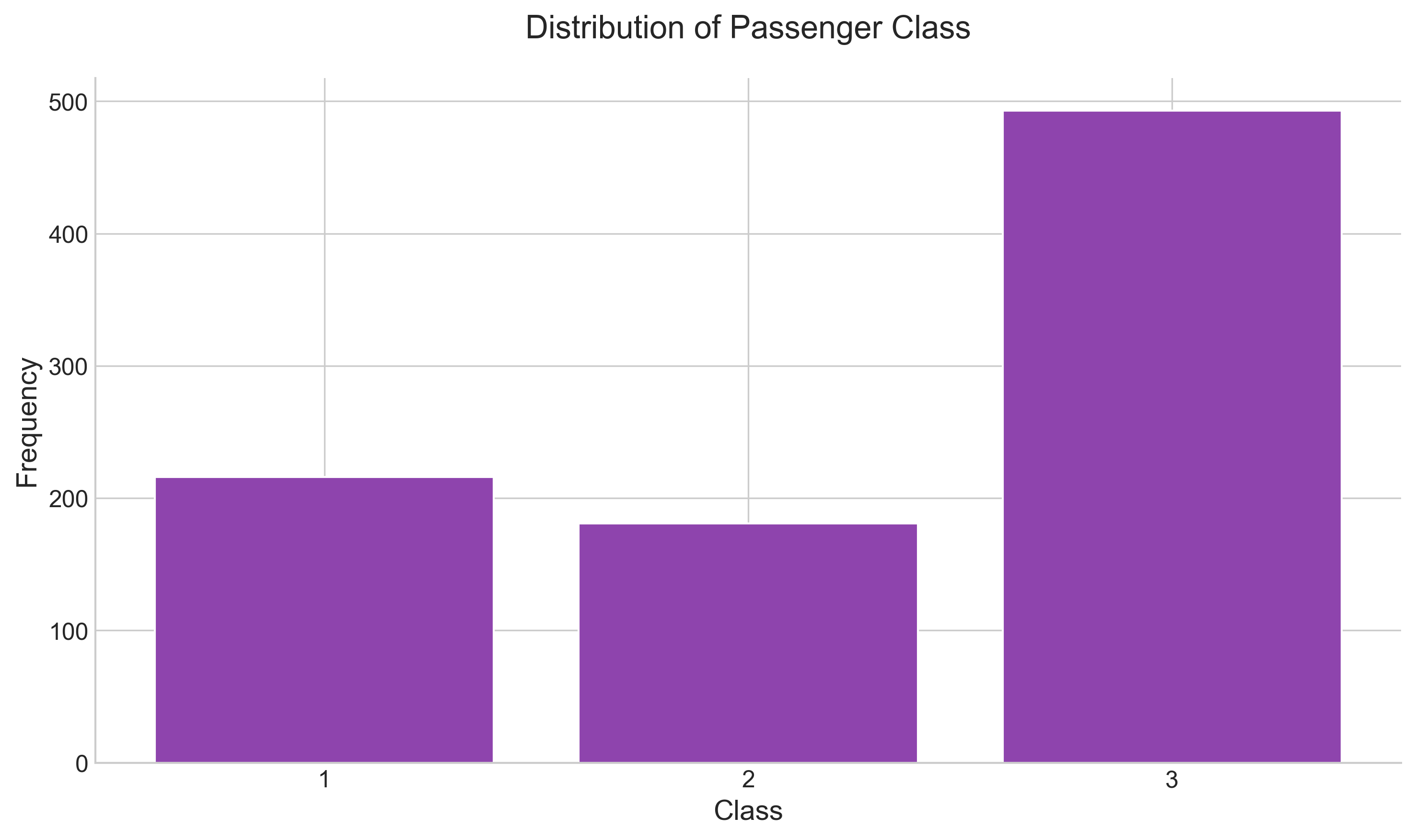
Question: Is this truly a numerical value that should be shown as a histogram? Not really! Even though the column value is a number, 'class' is a categorical value (Ordinal), and as such, a bar chart might be a better representation. However, with custom bins, we can make a histogram work.
Another numerical example that is indeed a candidate for a 'histogram' is age:
titanic["age"].plot(kind='hist', bins=20, color='#1abc9c', edgecolor='white')
plt.title('Age Distribution')
plt.xlabel('Age')
plt.show()
Output:
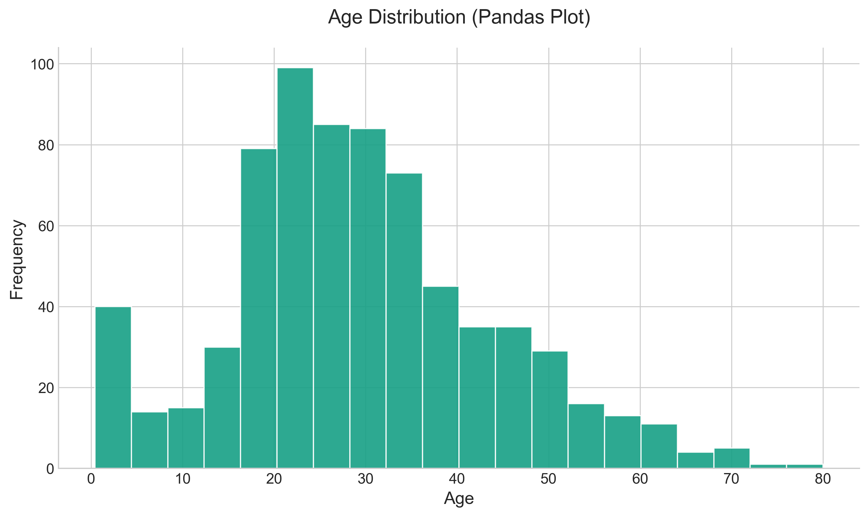
Note that Pandas automatically handles the NaN values by excluding them, unlike standard Matplotlib which would require explicit dropping.
Missing values are dropped, left out, or filled depending on the plot type. The way Pandas handles missing values is as follows:
| Plot Type | NaN Handling |
|---|---|
| Line | Leave gaps at NaNs |
| Line (stacked) | Fill 0’s |
| Bar | Fill 0’s |
| Scatter | Drop NaNs |
| Histogram | Drop NaNs (column-wise) |
| Box | Drop NaNs (column-wise) |
| Area | Fill 0’s |
| KDE | Drop NaNs (column-wise) |
| Hexbin | Drop NaNs |
| Pie | Fill 0’s |
If any of these defaults are not what you want, or if you want to be explicit about how missing values are handled, consider using fillna() or dropna() before plotting.
Official reference
- It is always good practice to have a title, x-axis, and y-axis labels in your chart. You can set all these and also change many other visual aids. Please refer to the full documentation on plots: https://pandas.pydata.org/pandas-docs/stable/generated/pandas.DataFrame.plot.html
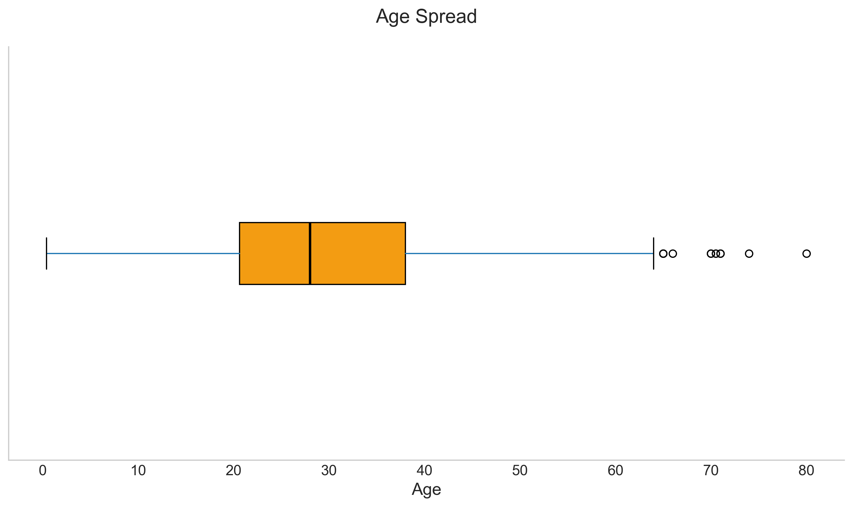
Apply box plot function on a numerical column
The box plot (also known as a box and whisker diagram) is a standardized way of displaying the distribution of data. It shows the median, quartiles, and outliers.
titanic.boxplot(
    column='age',
    vert=False,
    grid=False,
    patch_artist=True,
    boxprops=dict(facecolor='#f39c12', color='#d35400'),
    medianprops=dict(color='black')
)
plt.title('Age Spread')
plt.yticks([]) # Hide y-axis as we are plotting a single variable
plt.show()
Output:
Apply pie chart function on categorical values
If you have 2 to 4 unique categories, you can also create a pie chart. Let's visualize the survival proportion:
separate = [0, 0.05]
colors = ['#ff9999','#66b3ff']

titanic['alive'].value_counts().plot.pie(
    explode=separate,
    colors=colors,
    autopct=lambda p: '{:.1f}%'.format(p),
    shadow=True,
    startangle=90,
    textprops={'fontsize': 14},
    ylabel='',
    figsize=(6, 6)
)
plt.title('Survival Proportion', fontsize=16)
plt.show()
Output:
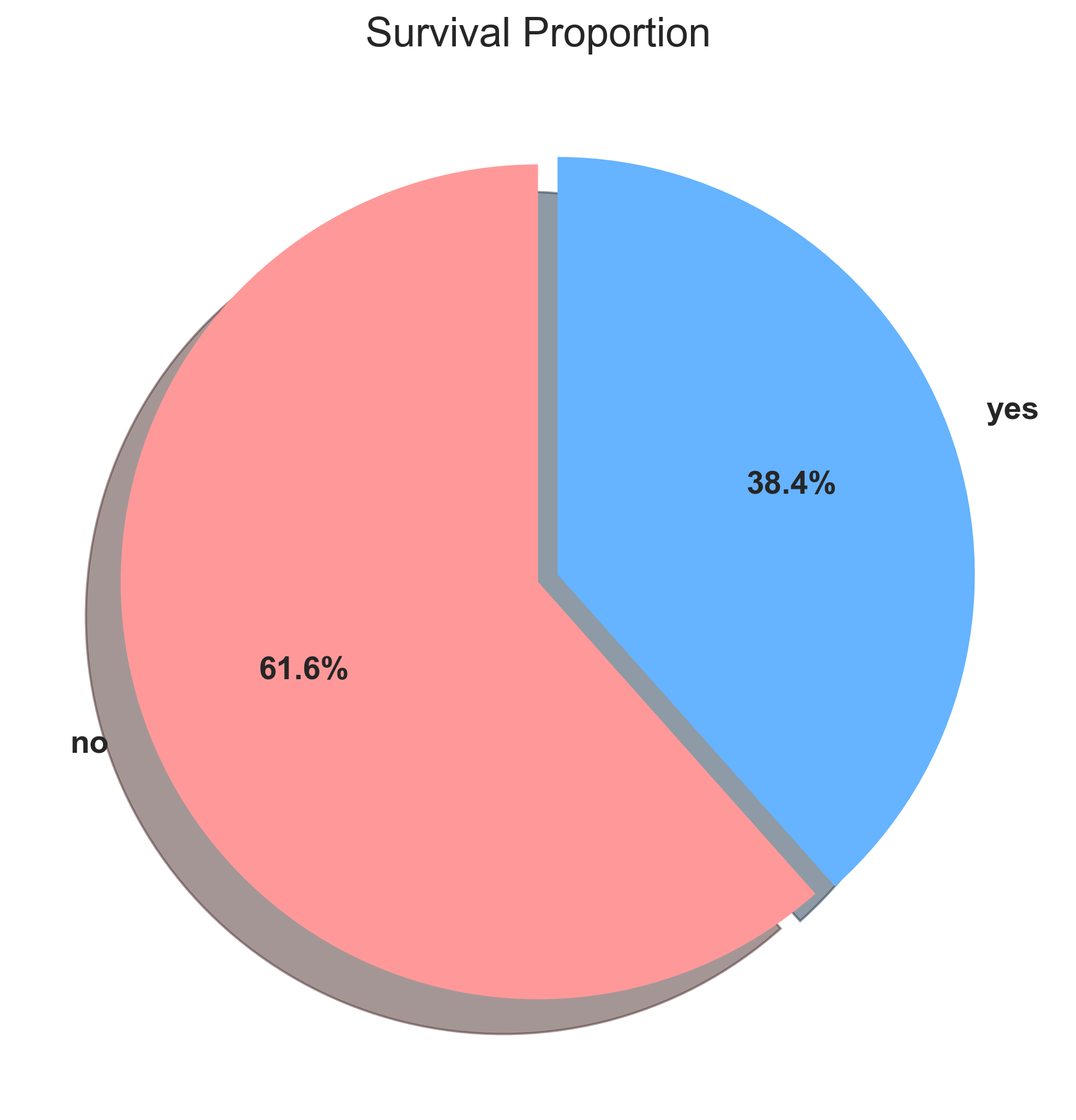
Note that the autopct setting enables you to display the percent value using a Python string formatter applied through a
lambda function. We also added a shadow for a 3D effect.
To move the label coordinate
Sometimes the wedge labels overlap the main label. In that case, you can move the label. Here is an example:
pie.yaxis.set_label_coords(-0.25, 0.5)
The label coordinates take an x and y offset from the default axes coordinates (0,0), which is the bottom left. (1, 1) is the top right.
** Making a Donut Chart **
You can add a white circle of the required dimension in the middle of the pie to make it a donut chart, which is often considered more modern and readable:
import matplotlib.pyplot as plt

separate = [0, 0.05]
colors = ['#ff9999','#66b3ff']

plt.figure(figsize=(7, 7))

ax = titanic['alive'].value_counts().plot.pie(
            explode=separate,
            colors=colors,
            autopct=lambda p: '{:.1f}%'.format(p),
            pctdistance=0.80,
            startangle=90,
            textprops={'fontsize': 14, 'weight': 'bold'},
            labels=None, # Hide labels to use legend
            ylabel=''
)

# Create the "donut hole"
centre_circle = plt.Circle((0, 0), 0.60, fc='white')
fig = plt.gcf()
fig.gca().add_artist(centre_circle)

plt.title('Alive vs Dead (Donut)', fontsize=18)
plt.legend(labels=titanic['alive'].value_counts().index, loc="center", fontsize=12)
plt.show()
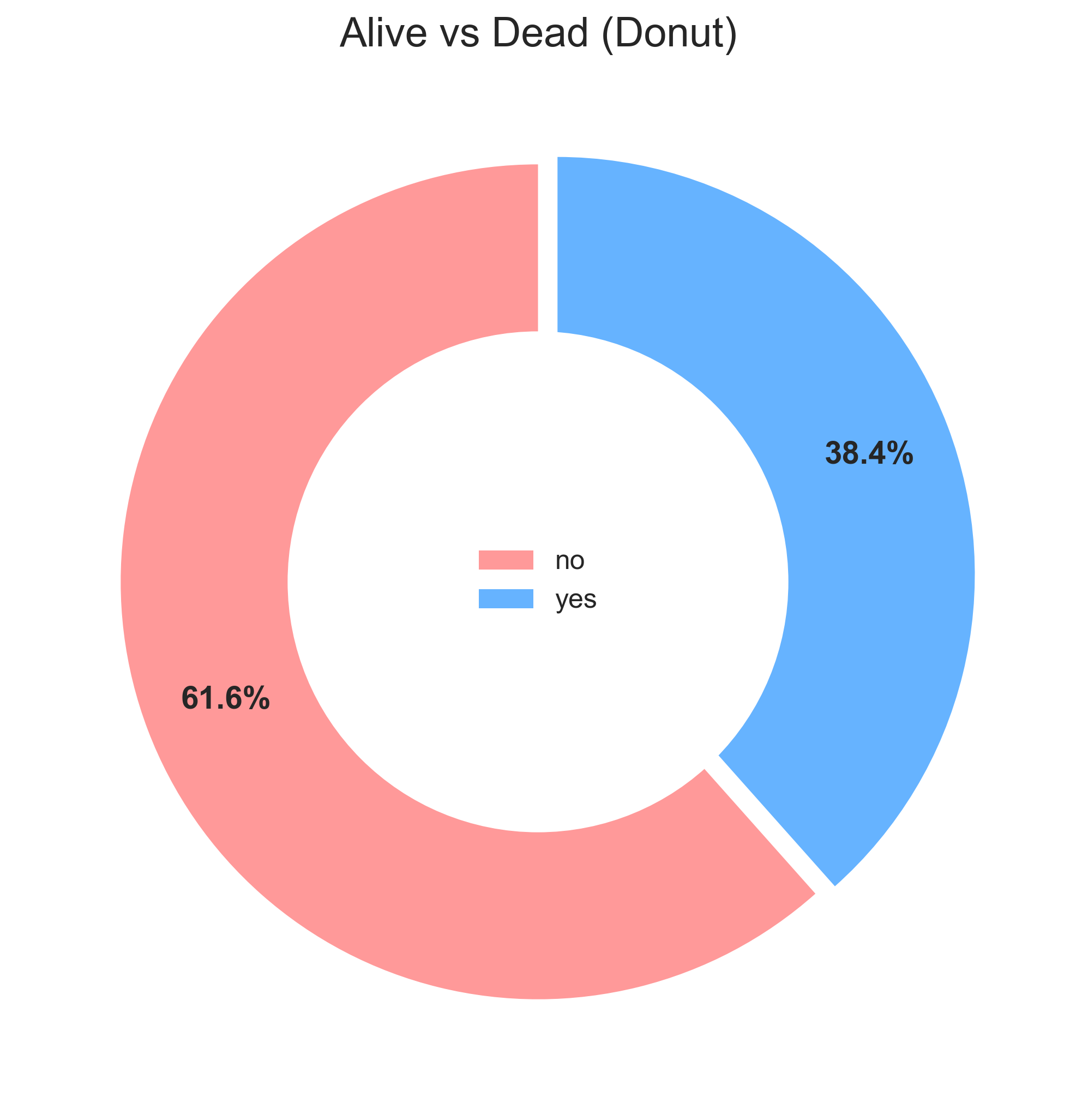
Note that we move the pctdistance to push the percentages towards the edge of the wedges and add a legend in the center for a clean look.
Variations
You can also use kind='pie' or kind='bar' as an attribute for the plot() function to get the same effect as a pie and bar chart.
Labels and label orientations
You can change the x-ticks, y-ticks, rotate the ticks, etc., using the subplot object. When you use Pandas to create diagrams, the subplot object is returned by default. You can save this returned object to then tweak the labels.
- Change the xtick label and rotate them
# Sort index to ensure order is 1, 2, 3
ax = titanic['pclass'].value_counts().sort_index().plot(
    kind='bar', color='#2980b9', rot=0
)

# Customize tick labels
ax.set_xticklabels(['1st Class', '2nd Class', '3rd Class'], rotation=30, ha='right')
plt.title('Passenger Class Count')
plt.ylabel('Count')
plt.show()
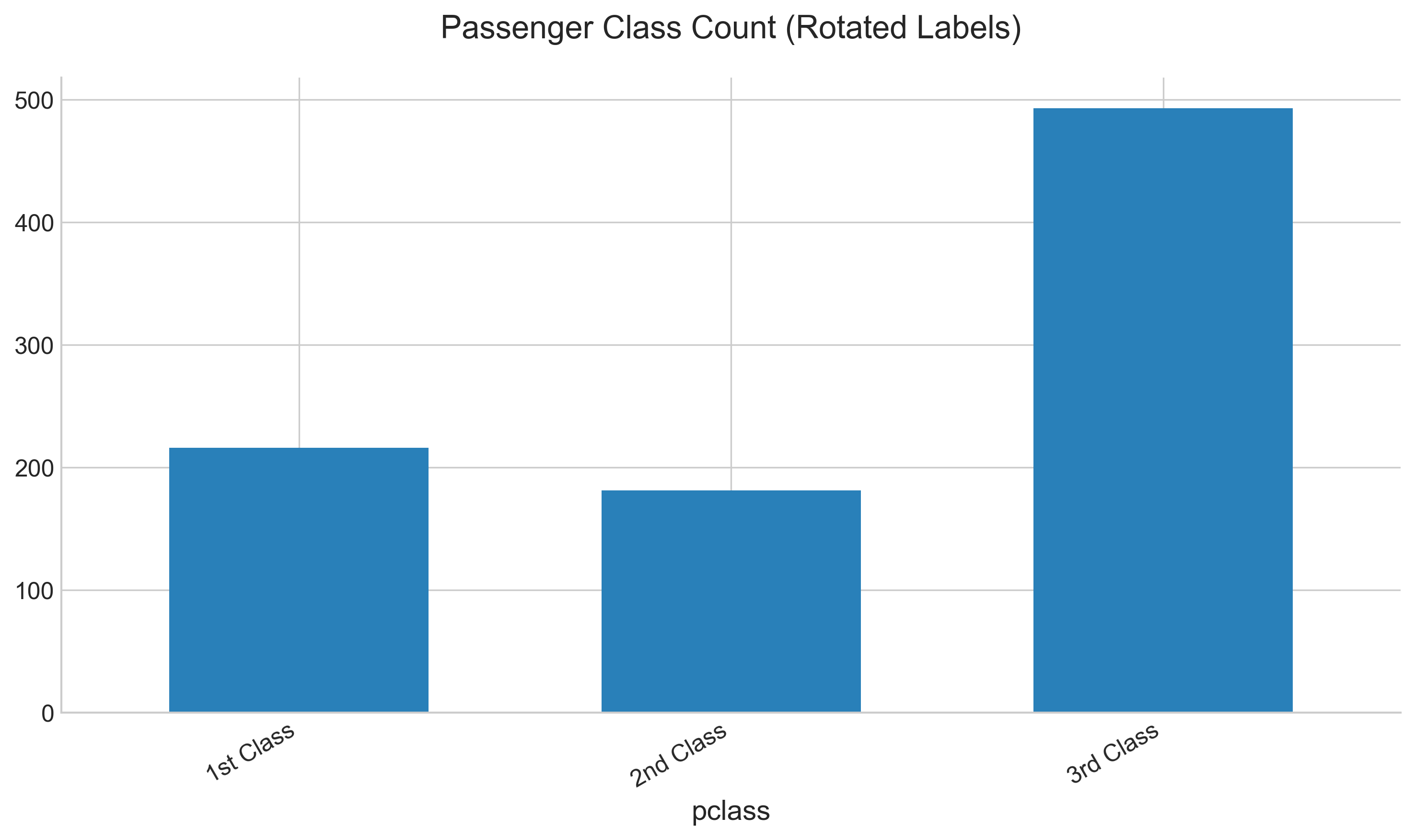
In this example, we rotated the labels by 30 degrees and aligned them to the right for better readability.
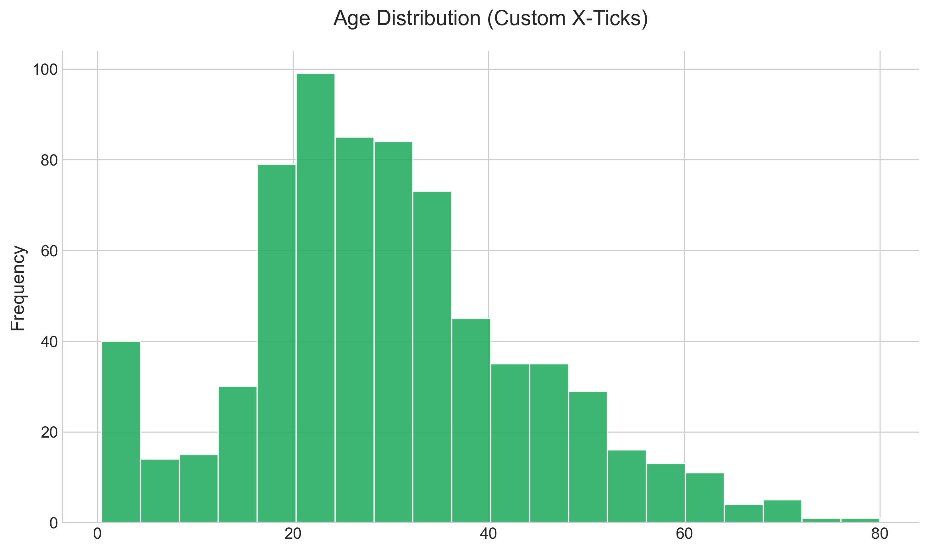
- Change the xticks
ax = titanic['age'].plot(
    kind='hist', bins=20, color='#27ae60', edgecolor='white'
)
# Manually set the x-ticks
ax.set_xticks([0, 20, 40, 60, 80])
plt.title('Age Distribution (Custom X-Ticks)')
plt.show()
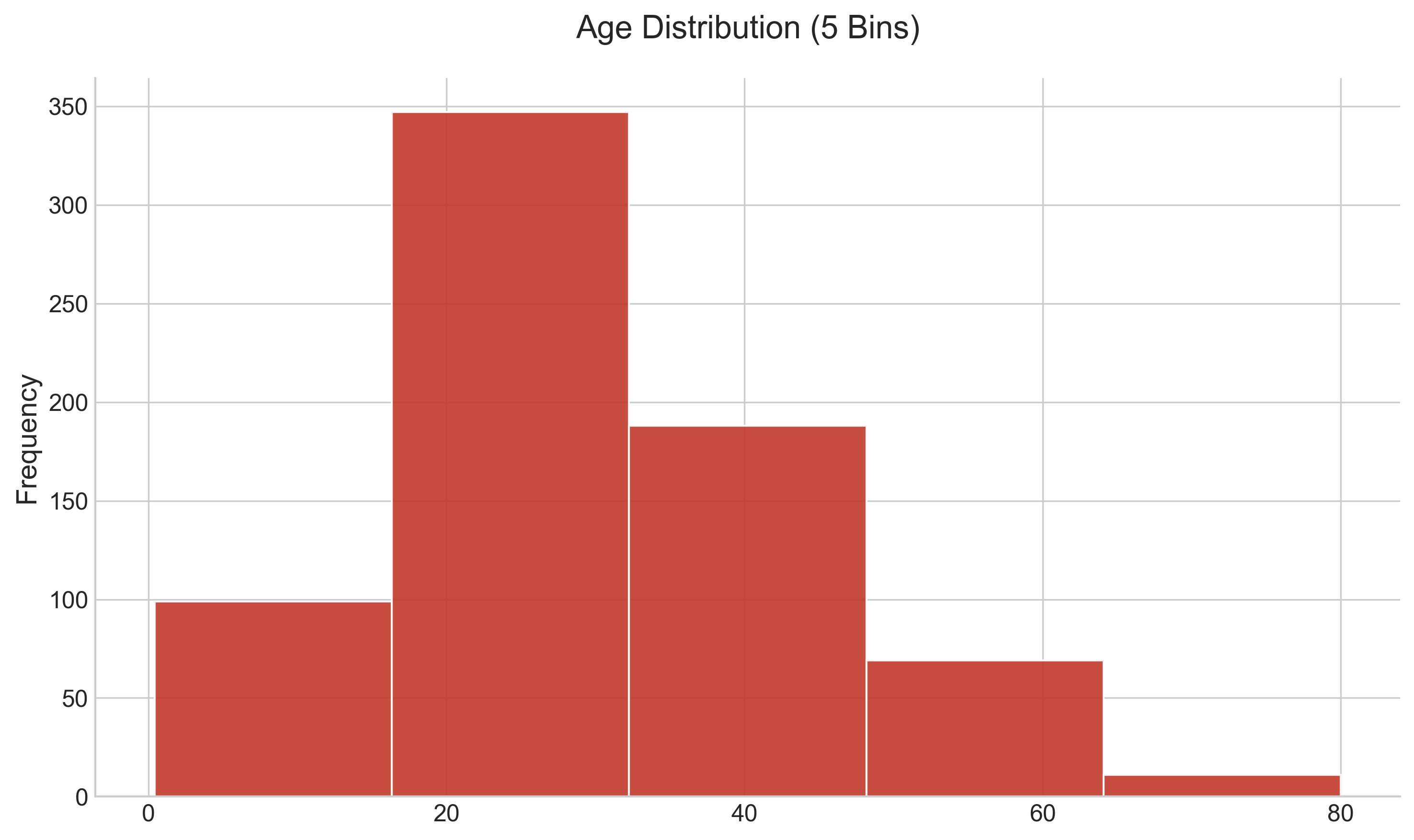
- Change the bin size and the xticks
ax = titanic['age'].plot(
    kind='hist', bins=5, color='#c0392b', edgecolor='white'
)
ax.set_xticks([0, 20, 40, 60, 80])
plt.title('Age Distribution (5 Bins)')
plt.show()
- Change the x-label and y-label
While you can set the 'title', 'x-label', and 'y-label' directly from the Pandas API, you can also set them directly on the subplots themselves. Here is an example:
ax = titanic['age'].plot(kind='hist')
ax.set(xlabel='Age', ylabel='Count', title='Age Distribution')
plt.show()
Note the two ways of setting the x and y labels: you can set them using the set_ylabel() function, or you can just use the set() function by setting the keyword arguments.
References:
Here is an article on a few more tips and tricks on Matplotlib: https://towardsdatascience.com/all-your-matplotlib-questions-answered-420dd95cb4ff