Geospatial Diagrams
With the advent of smart devices like phones, wearables, and IoT devices, the collection of geospatial data seems to be the norm rather than an exception.
Geospatial data is typically collected as the longitude (lon) and latitude (lat) of a given point on Earth. If the collected information is through GPS, the lat/lon accuracy is very high. But if the collected information is based on the IP address of a cable network provider or cellular network provider, the accuracy of the information is not great. Be mindful of the analytic inferences made based on the quality and source from where the geospatial data is collected.
There are a plethora of libraries that help you analyze and display geospatial information. In this lesson, you will learn a few techniques.
Seaborn LM plot
An lmplot shows the lat/lon values on a 2D x and y-axis, which is not a true geo-representation. However, for small areas, it barely matters, and an lmplot would do the job just fine. Here is an example that shows all the demolition sites of the 'Able Demolition' group, and although it is shown on a 2D plane, it still looks like a map of Detroit City. Check it out:
import pandas as pd
import matplotlib.pyplot as plt
import seaborn as sns

detroit_demolitions = pd.read_csv(
    "https://raw.githubusercontent.com/jravi123/datasets/refs/heads/main/datasets/Detroit_Demolitions_withColumns.csv",
    parse_dates=[4],
)


sns.lmplot(
    x="Longitude",
    y="Latitude",
    data=detroit_demolitions[
        detroit_demolitions["Contractor Name"] == "Able Demolition"
    ],
    fit_reg=False,
    height=10,
    aspect=1.2,
)

plt.title("Demolition sites of Able Demolition Group in Detroit City")
plt.show()

- Detroit city map from Google Maps

From the output above, you can notice that the 'Able Demolition' company has had demolition contracts at so many points in Detroit City that the plot of the demolition sites almost represents a map of Detroit City.
Using Basemap
You can also create cool-looking geomaps using Basemap. However, the one drawback is that Basemap is not part of Anaconda, so you have to install all the necessary packages before using it.
Here are the instructions to install Basemap if you are writing your notebook on https://colab.research.google.com
Note: The instructions below are only for Colab and do not work on your local computer.
!!pip install basemap
Once it is installed, you are now ready to start using Basemap to plot geomaps. Here is an example of plotting earthquake locations using Basemap:
import numpy as np
import pandas as pd
import matplotlib.pyplot as plt
from mpl_toolkits.basemap import Basemap

df = pd.read_csv('http://earthquake.usgs.gov/earthquakes/feed/v1.0/summary/all_week.csv')
print (df.head(1))


plt.figure(figsize=(16, 14))

# The projection value 'robin' will get you the map in Robinson projection.
# Note: the resolution value is a lowercase 'l', not '1'.
m = Basemap(projection='robin', lon_0=-90, resolution = 'l', area_thresh = 1000.0)
m.drawcoastlines()
m.drawcountries()
m.fillcontinents(color='green')
m.drawmapboundary(fill_color='grey')

# draw latitude and longitude lines
# The arguments for np.arange() specify where the
# latitude and longitude lines should begin and end,
# and the spacing between them.
m.drawparallels(np.arange(-90.,99.,30.))
junk = m.drawmeridians(np.arange(-180.,180.,60.))

# Mark points by passing in lat/lon values
x,y = m(df['longitude'].values, df['latitude'].values)

# Plot the points by setting the marker color to yellow
m.plot(x, y, 'yo', markersize=4)
plt.title('Earthquake Locations')
plt.show()

Most of the settings for Basemap are self-explanatory. Here is a link to the documentation detailing the settings: https://matplotlib.org/basemap/api/basemap_api.html
lon_0 sets the center of the map domain in degrees. You can also set lat_0 in a similar way.
Zooming in
You can zoom into the California region to take a closer look. You have to set the width and height from the center lat/lon in meters or set the lat/lon of the lower-left corner (llc) and the upper-right corner (urc) of the interested area. The example below sets the width and height. The width is 1 x 1,000,000 = 1E6 meters (1000 km), and the height is 1.2 x 1,000,000 = 1.2E6 meters.
fig = plt.figure(figsize=(8, 8))
m = Basemap(projection='lcc', resolution='h',
            lat_0=37.5, lon_0=-119,
            width=1E6, height=1.2E6)
m.shadedrelief()
m.drawcoastlines(color='gray')
m.drawcountries(color='gray')
m.drawstates(color='gray')

# Mark points by passing in lat/lon values
x,y = m(df['longitude'].values, df['latitude'].values)

# Plot the points by setting the marker color to yellow
m.plot(x, y, 'ro', markersize=4)
plt.show()

While the examples above get you started, you can indeed get many other types of projections, set legends, change marker sizes, etc. Please refer to the documentation given below to play with them.
- Installation on your computer: https://matplotlib.org/basemap/users/installing.html
- Background: https://matplotlib.org/basemap/users/geography.html
- Basemap main: https://matplotlib.org/basemap/
Plotly Choropleth
Choropleth maps are visually appealing maps that display geographic areas, showing the level of variability within a region. Data with geographic units, such as countries, states, provinces, and counties, are very common, and using choropleth maps would be ideal to show statistical or parameter values.
Plotly provides a convenient choropleth function. Here is an example that shows the unemployment rate across various counties in the US, represented by the FIPS county code. Note that the GeoJSON file also has the same FIPS county code as the ID parameter for each county:
from urllib.request import urlopen
import json
import pandas as pd
import plotly.express as px

with urlopen(
    "https://raw.githubusercontent.com/plotly/datasets/master/geojson-counties-fips.json"
) as response:
    print(type(response))
    counties = json.load(response)


df = pd.read_csv(
    "https://raw.githubusercontent.com/plotly/datasets/master/fips-unemp-16.csv",
    dtype={"fips": str},
)


fig = px.choropleth(
    df,
    geojson=counties,
    locations="fips",
    color="unemp",
    color_continuous_scale="Viridis",
    range_color=(0, 12),
    scope="usa",
    labels={"unemp": "unemployment rate"},
)

fig.update_layout(
    margin={"r": 0, "t": 0, "l": 0, "b": 0}
)  # set the margin to 0 for the right, top, left, and bottom of the figure
fig.show()
Note: The choropleth function shown above only works for the latest version of Plotly, and Colab, by default, has an older version. To update to the latest version, run the command below:
!pip install -U plotly
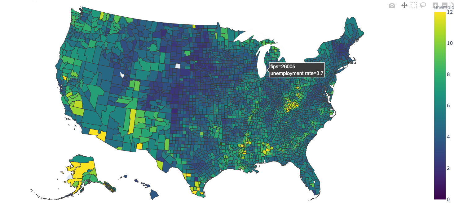
In this example, the GeoJSON file consisting of counties is first read into the counties dictionary. This dictionary is then fed to the choropleth function along with the data consisting of the county-wise unemployment information.
Note, however, that many a time you may have the county information, but the original data may not have the FIPS code for the county.
And the GeoJSON that is fed to the choropleth function is based on the FIPS code. You can add a FIPS code to your dataset using the addfips module. Here is an example:
First, install the addfips module with the command below:
pip install addfips
Then, apply a lambda function on the row by passing in the county and state values to the get_county_fips() function. Save the returned value in a new column. Here is an example:
import addfips
import pandas as pd

df= pd.DataFrame({
                'COUNTY': ['wayne','brown','fresno'], \
                'rate': [3.2, 5.5, 3.5],  \
                'state':['MI', 'IL', 'CA']
                })
af = addfips.AddFIPS()

df['fips'] = df.apply(lambda row: af.get_county_fips(row['COUNTY'], row['state']), axis=1)

df.head()
Output:
 	COUNTY	rate	state	fips
 0	wayne	3.2	MI	26163
 1	brown	5.5	IL	17009
 2	fresno	3.5	CA	06019
axis=0will apply the lambda function to the COLUMN object and will iterate as many times as the number of COLUMNS present.axis=1will apply the lambda function to the ROW object and will iterate as many times as the number of ROWS present.
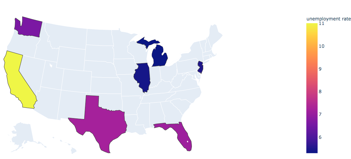
Geo plot with US State codes only
If you want to show the boundaries based on the state and not on counties, you can remove the fips keyword argument
and instead add the locationmode='USA-states' keyword argument with locations being set to 'states', as shown below:
df = pd.DataFrame(
    {
        "state": ["MI", "IL", "WA", "NJ", "TX", "FL", "CA"],
        "unemp": [5.3, 5.4, 6.6, 5.5, 7.2, 7.1, 11],
    }
)

fig = px.choropleth(
    df,
    locations="state",
    locationmode="USA-states",
    color="unemp",
    scope="usa",
    labels={"unemp": "unemployment rate"},
)
fig.show()
Note that in the examples above, we went with the default color settings. These are some examples to get you started, but please do refer to the official documentation to learn more about all the arguments that you can set.
- GeoJSON: https://geojson.org/
- Plotly: https://plot.ly/
- Choropleth: https://plotly.com/python/choropleth-maps/
- Adding FIPS to your data: https://pypi.org/project/addfips/
While the basic Plotly module is an open-source project, there are many extensions to Plotly, like Dash Enterprise and Chart Studio Enterprise, which are proprietary.
Leaflet
Leaflet is another open-source, JavaScript-based library for map functionality. The library itself is very lightweight and loads really fast. For this to work, you not only have to download the library but also extensions to Jupyter. More details here: https://github.com/jupyter-widgets/ipyleaflet
GeoPandas
Another popular geo library based on Pandas is GeoPandas. More details here: http://geopandas.org/
GeoPandas is based on GeoSeries and GeoDataFrame, which are subclasses of Pandas Series and DataFrame, respectively, and are based on three geometric objects: Points, Lines, and Polygons.
Other libraries
There are many other libraries, among which Google Maps stands out from the crowd for its feature-rich and interactive map capabilities.
Reference:
- Google Maps API: https://github.com/pbugnion/gmaps